We’re going to start our exploration of visual design techniques by talking about composition, or how you lay out and balance the components of a page or screen. But before we get into composition techniques and principles, let’s first learn about how people visually scan pages and screens.
Visual designers have long been interested in figuring out how to guide readers’ eyes across the printed page or computer screen. Artists creating posters use emphasis and positioning to draw your attention to a headline; cartoonists carefully draw cartoons so that you notice the characters and read the speech bubbles in a certain order; otherwise, the jokes might not make any sense.
By laying out elements on the page in certain ways, you can affect the order in which people will notice the elements and how long they will spend looking at them. Or, perhaps more relevant for software designers: If you know that people will tend to scan a page in a certain way, you can design your page to accommodate those usage patterns, by putting relevant information in the places where people are likely to look.
So, let’s begin by examining how readers read text on a page.
If a reader is reading a book, like a novel, where every page consists of rows of text (we’ll assume there are no illustrations), then the reader will start by looking at the first word in the top-left corner of the page, scan across the line from left to right to read the words, and then skip to the beginning of the next line. The reader will again scan left to right to read the line, skip to the next line, and continue in this pattern until the bottom of the page is reached. (And, yes, in languages like Arabic and Hebrew, readers will read right-to-left instead.)
However, when the eye scans across a line of the text, it’s not actually a smooth movement as you might expect. Rather than moving smoothly in a line, the eyes instead jump rapidly between spots on the page, called fixation points. These jumps are called saccades. The brain doesn’t receive any visual information during saccades, but it’s able to stitch together the images received at the fixation points, and the brain perceives it as “seeing in a line”.
The area that you can see clearly at each fixation point – i.e., the area that you can focus on – is called your foveal vision, and that area is surprisingly small: it’s only about two degrees of your visual field, or about twice the width of your thumb if you stick your thumb out at arm’s length. Try holding your arm out straight and put your thumb on a paragraph of text on your screen right now. Look at your thumb, and without looking away, try to see how many words on the screen you can clearly distinguish around your thumb. Your area of focus is pretty limited, isn’t it? You’re still able to perceive the rest of the screen in your peripheral vision, but you can’t see those other parts of the screen clearly; you can only resolve text in the narrow area that you’re focusing on.
Now that we know a bit more about how human vision works, let’s go back to how readers perceive pages and screens. For page layouts that are more complex and heterogeneous than solid blocks of text, it’s more difficult to say exactly how readers’ eyes will move across the page, and of course, it will differ for each reader, but we can try to make some generalizations.
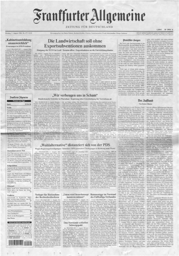
Traditionally, visual designers have said that when readers look at a complex document like a newspaper, they generally first get an overall impression by scanning the page in a Z-shaped pattern. They start in the upper-left corner, read the title of the newspaper across the top, and then, beginning at the upper-right corner, they gradually skim over the page in a roughly diagonal line until they reach the lower-left corner. Then they skim across to the right, ending in the lower-right corner. Then readers will go back and focus on whatever interests them.
Naturally, this is a vast generalization (and I’m not sure if there are any studies to support this, or whether this is just conventional “received wisdom”). It’s probably true for newspapers without much in the way of color photos or attention-getting headlines… like the staid German daily Frankfurter Allgemeine Zeitung:
 But if there is something flashy or exciting on the page – a large color photo, or a bold, interesting headline – the reader will probably look at that first, or perhaps the reader may indeed begin a Z-shaped scan, but interrupt it to look at the interesting bits. Do your eyes follow a Z-shaped scan when you see this Bild tabloid?
 Again, general page-scanning patterns are generalizations, and there will be countless exceptions. For example, someone looking for some specific detail will probably search through the page in a different pattern than someone who is just browsing.
We’ll continue this discussion in the next post, where we’ll look at what eye-tracking studies can tell us about how people look at a page or screen.
[ad#AdSense_Banner]


