The Gestalt Laws of Perception help explain how humans perceive and make sense of visual information. As user interface designers, the laws are interesting to us because they can help us better communicate concepts and relationships that exist in our underlying conceptual model for the application.
Gestalt (pronounced ge-SHTALT) is a German word that means roughly means “shape”, “form”, “essence”, or “whole”. Gestalt psychology is based on the idea that, when the human mind perceives the world, it seeks to recognize some kind of structure or order. Specifically, the Gestalt effect suggests that, when we are presented with a complex visual image, our minds recognize coherent, whole forms, rather than individually perceiving all of the smaller constituent parts that make up the image.
That might sound pretty heavy and abstract, so let’s take a closer look to understand what all of that really means.
Wertheimer’s laws
Max Wertheimer’s 1923 paper Laws of Organization in Perceptual Forms (PDF of original article in German) stated a number of principles or “laws” that describe how the mind tends to perceive visual information.
Law of Prägnanz
The basic law, from which the others are derived, is the Law of Prägnanz. Prägnanz might be roughly and imperfectly translated as conciseness or simplicity.
The Law of Prägnanz is a bit like Occam’s Razor. Occam’s Razor states that the simplest explanations for a state of affairs tend to be more likely to be correct than complicated and convoluted explanations that rely on odd assumptions or special conditions. (For example, “an alien stole my homework” is probably an unlikely excuse for why an assignment wasn’t handed in; “I just didn’t do my homework” is a simpler and likelier explanation as it doesn’t presume the existence of extraterrestrials.)
The Law of Prägnanz says that when the mind tries to interpret a visual scene, it will try to interpret it in the simplest, most concise, and most easily recognizable way. In particular, the mind will try to perceive the scene as a whole rather than as a sum of parts.
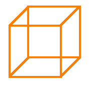
For example, when you see the following illustration…
…you probably recognize it as a cube. You don’t think of it as twelve separate lines, nor do you think of it as four parallel horizontal lines, four parallel vertical lines, and four parallel diagonal lines.
In trying to explain how the mind tries to perceive complex scenes, Wertheimer elucidated the following laws that contribute to the Law of Prägnanz. We’ll take a look at each one and try to find examples relevant to user interface design.
Law of proximity
Items that are located close together are usually perceived as a single group. The items in that group are considered to be distinct and different from items located further away.
For example, in the following image, we seem to perceive three separate groups:
    o o o                                 o o
    o o o          o o o o o              o o
    o o o          o o o o o              o o
                   o o o o o              o o
                   o o o o o
And in the following image, some of these dots appear to be arranged in rows, and others in columns.
    o o o o o o o o o o o        o     o     o     o     o
                                 o     o     o     o     o
    o o o o o o o o o o o        o     o     o     o     o
                                 o     o     o     o     o
    o o o o o o o o o o o        o     o     o     o     o
It’s due to their proximity. The distance between the dots making up each row or column is less than the distance between a dot in one row or column and the nearest dot in the next row or column.
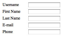
Applying the law of proximity to user interface design, take a look at this form:
 Conceptually, each label matches up with a corresponding text-entry field. And yet the labels are so far away from the text-entry fields that the labels appear to form their own group, and the fields appear to form another group. The connection between each label and its corresponding field isn’t perfectly obvious.
One way to fix this is to move the labels and fields closer together so that we’re emphasizing the horizontal pairs of labels and fields rather than the two columns:
Law of similarity
Visual items that share some property or attribute are perceived as belonging together, whereas items with differing properties or attributes are perceived as belonging to different groups.
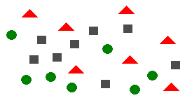
For example, in the following image, you can probably detect three groups, even though the items in those groups aren’t in proximity to each other:
This is the law of similarity at work with two attributes: shape and color. The red triangles are easily detectable because they share the same shape and color, and the red triangles are distinguishable from the green circles and the grey squares because those items differ in those two attributes.
An example from UI design comes from file managers in operating systems: Usually, all of the files of the same type (like MP3 files) are decorated with the same icon, to provide a visual indication that those files share something in common. In the following example from my Mac, the icons aren’t different enough that you can instantly tell that they’re different (they all have the same basic “curled page” shape and they all have a bit of blue in them), so the effect is not quite as strong as it could be:
However, in the next image, the “highlighting” decoration on selected items easily differentiates the group of selected items from the group of unselected items:
Returning to the data-entry form example, if we wanted to improve the form without moving the groups closer together, we could also try making the pairings more explicit by making sure that each label and field share an attribute, like the background color:
Law of continuation
Visual items that appear to be a continuation of a preceding sequence or line of similar items are perceived as belonging together. As well, once your eye begins following the line or sequence, it will continue doing so until something else catches your attention.
For example, the icons on this Eclipse splash screen are arranged to a form a curve that your eye is likely to follow:
Law of closure
Lines (or visual elements that are repeated to form lines) are more likely to be perceived together as a common visual unit if they appear to form the outline or “closure” of a surface or shape, even if that outline is not complete. The mind fills in any gaps in incomplete shapes, to achieve closure in the form of a familiar shape.
In the following classic example, we perceive the image to be a circle, even though part of the circle is missing:
Our minds fill in the missing gap because “it’s a circle with a piece missing” is an easier and more satisfying explanation than, say, “it’s an arc spanning about 320 degrees”.
I can’t think of many immediate applications to user interface design, with the exception of logos and other decorative artwork that might appear on webpages or splash screens. Some visual designers suggest that incomplete shapes can create interest; the mind has to do a bit of work to fill in the missing information, and this “puzzle-solving” is apparently captivating and eye-catching. For example, this logo crops a geometric flower shape, and it’s somewhat eye-catching because you have to complete the pattern to achieve closure:
Law of common fate
Visual elements moving together in the same direction simultaneously tend to be perceived as a group.
For example, in Microsoft Windows or Mac OS, if you select a number of icons and then drag-and-drop them, partially-transparent copies of all of the selected icons move together as a group:
Law of good continuation (or “good gestalt”)
Line segments that are smooth continuations of each other are perceived as the same line, even in the case of intersections of multiple line segments.
For example, when you see this figure:
You probably perceive it as the two straight lines crossing:
You are unlikely to perceive it as two angles meeting, even though that is a possibility as well:
Your mind knows from experience that the “two straight lines crossing” is more plausible.
I can’t think of a good application of this law to UI design, but I’ve included it for completeness.
Further laws
Beyond Wertheimer’s laws, additional laws have been proposed, such as:
Law of common region (Palmer, 1992)
Visual items situated together in demarcated (bordered) regions are perceived as belonging together.
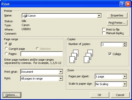
For example, in this Print dialog from Microsoft Word, controls are contained in frames; obviously all of the controls in the “Copies” frame belong together and relate to controlling the number of copies:
Law of synchrony (Palmer and Levitin, 1998)
Visual items that change at the same time will tend to be perceived as belonging together as a unit.
Law of connected elements (Palmer and Rock, 1994)
If items are joined together to form a compound item, that compound item will tend to be perceived as a single object (not surprisingly).
Summary
The Gestalt Laws of Perception help us understand how people interpret visual designs. In designing user interfaces, applying these laws can often help us to reinforce our underlying conceptual models. For example, we can intentionally group related fields together on the screen to indicate that they are related, or use similar icons or other decorations to provide visual clues that certain objects belong to a certain class.
We will continue our examination of visual design techniques in upcoming blog posts.
[ad#AdSense_Banner]


Very useful summary.
Great article, thank you