When you’re designing the visual layout of a website or a software application’s user interface, you want it to look good. But what makes a good design good?
Graphic designers often say that aesthetically-pleasing creative works possess unity. By this, they mean that everything simply just fits together and “flows” well.
Your page composition exhibits unity when…
- all the elements on the page appear to belong there;
- there are no extraneous elements that don’t belong there; and
- all the elements are arranged in such a way that they appear to belong together.
Unity is obviously a goal you should aim for. But it’s hard to explain exactly what makes a design exhibit unity, and even harder to create a step-by-step checklist of how to achieve it – after all, visual design is an art, not a science!
At the very least, when you’re designing your page layouts, you should try to keep the following principles and ideas in mind:
- Consistency: Visual elements like fonts, colors, rules, icons, and decorations should be used consistently across the page.
- Coherence: The design should make sense conceptually. Elements with similar functions and similar importance should be styled with similar attributes (size, color, font, weight); elements that are of the same general type but which differ in importance should share certain attributes but vary others.
For example, if your design has three levels of headings, they should typically all share the same typeface, but the more-important levels of headings should use a larger type size or thicker weight than the headings at lower levels of importance. In a future post, we’ll further explore this idea of creating a logical visual hierarchy to graphically express relationships and concepts like relative importance.
- Continuity: The same visual style and layout scheme should be repeated across all pages on the website, or across all screens and dialogs in a desktop application. Ideally, this consistency should be maintained across all of your organization’s products. Adobe does a great job of maintaining a unique and consistent look-and-feel across all the programs in its Creative Suite product line; in constrast, in Microsoft Office 2007, programs like Word, Excel, and PowerPoint used the “ribbon” menu but Visio did not.
- Simplicity, restraint, and minimalism: While you do want to make your pages look interesting and eye-catching, you should aim to create a simple design rather than one cluttered with excessive fancy decorations and distractions.
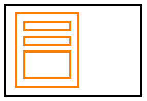
- Balance and dominance: You want to use the space on the page effectively and attractively. If your page is tightly-packed with content on the left side, but the right side is empty, your page will look lopsided. If you tried to somehow balance the page on a scale, it would tip over to the left:
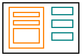
 This doesn’t necessarily mean that all pages have to be symmetrical, however. Asymmetrical designs tend to look more interesting — graphic designers call it “dynamic tension”. Even though an asymmetrical design might have a dominant feature, like a large, eye-catching panel on the left-hand side, the design could still achieve balance by positioning, say, three smaller boxes on the right-hand side:
- “Good Gestalt”: You should be able to perceive the design as a coherent whole, rather than a chaotic mish-mash or mosaic of elements.
A design that expresses unity gives the viewer the impression that there is some kind of underlying concept or scheme giving order to it. You want the viewer to feel that there was an intelligent designer behind the work, and that the designer deliberately and intentionally chose and developed that particular design. The alternative is for the viewer to suspect that the design was slapped together haphazardly or by accident – and you don’t want that!
So for websites and applications that have many pages or screens, consistency and unity in the visual design is key for creating a pleasant User Experience.
Think of it this way: It takes mental effort for a user to look at and make sense of a page. Users look for patterns, and once they start to see patterns, they begin to form expectations. It becomes distracting and even disturbing when these expectations are then violated by inconsistent or sloppy design.
If your design is consistent and exhibits unity, users will begin to trust the design (and by extension, the designer). This trust sets users’ minds at ease. They can relax, knowing that they’ve figured out the patterns and concepts that underlie the design, and they no longer need to spend mental effort on that task.
In upcoming posts, we will continue exploring the use of visual elements, visual attributes, and visual design principles in order to learn how to create attractive and understandable user interfaces.
[ad#AdSense_MedRect]


