Visual elements are the things you put on your page or screen. For a software application, this can include user interface widgets like text fields, buttons, drop-down boxes, menus, and so on. But it also includes text, images, icons, and organizational or decorative elements like borders, lines, and separators.
Visual attributes are properties of visual elements – the different ways that you can “style” the visual elements on the page.
In designing the visual style for your application or website, you’ll need to decide on a system of arrangement of visual elements, combined with a consistent way to style those elements using visual attributes. Elements with similar function and meaning should usually be styled the same way.
But you can also selectively use attributes to create contrast. Contrast is an intentional difference between two elements. Contrast can be eye-catching, and we can intentionally use contrast to highlight or draw attention to a particular element, or to provide clues that two elements are different in some conceptual way.
Here are some of the main visual attributes you need to be aware of:
Size
The most instantly noticeable visual attribute of all is size. We can’t help but notice when one element is bigger than another, and, all other things being equal, our eyes will almost always look at the biggest thing on a page first. So size can be used to draw attention to something.
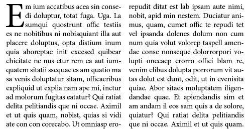
For example, book designers have for centuries used “dropcaps” – like in the “E” in the paragraph below – to help direct the eye to the beginning of long blocks of text (which are not always visually exciting):
 If an element is bigger than other surrounding elements, the contrast in relative size makes the bigger element visually dominant. We perceive a big, dominant element to be more important than the other elements.
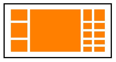
For example, here, despite not being able to see the contents of the panels, we would generally assume that the big center panel is the most important on the basis of its size:
 The relative size of elements can be used to communicate the intended relative importance of those elements – for example, you might expect that certain features will be used more frequently, so you might make the buttons for those features larger than the buttons for lesser-used features.
Users may also have their own expectations for what is important and not, and they could be annoyed if seemingly irrelevant things are taking up too much screen real estate.
For example, a time-and-date clock in the corner of an accounting program should be small because, while convenient, it has little to do with the main task of the application. However, in a “chyron” system for overlaying graphics onto live television broadcasts, a time clock with millisecond precision is pretty important for synchronization, and so making it quite large and prominent would be justifiable and expected.
Size contrasts can also be used as a highlighting technique. For example, in this particular view of the Mac OS dock, the currently selected item is biggest:
Color
After size, color is generally regarded as the next most immediately noticeable attribute. Colors, if applied carefully, can be used to attract attention and guide the eye. Color can also work very well for suggesting importance: brighter, more intense colors tend to suggest more importance and urgency than duller, muted colors.
![]() Color can also be used to suggest similarities and differences. Elements sharing identical colors are perceived as belonging to the same group, whereas elements with contrasting colors are perceived as belonging to different groups.
Color can also be used to suggest similarities and differences. Elements sharing identical colors are perceived as belonging to the same group, whereas elements with contrasting colors are perceived as belonging to different groups.
Colors can also have implied, culture-dependent meanings, like red indicating “danger” or “stop”, or green meaning “OK” or “go”.
(Color is an important and complicated topic that we’ll explore in more detail in future blog posts.)
Shape
We can perceive and differentiate the outlines of shapes very easily: we can quite rapidly tell the difference between squares, circles, and triangles.
You can draw attention to one object if it has a different outline shape than the objects surrounding it – for example, a round or a pointy angular shape in a sea of boxes.
 As shown in a previous post, the icons in the following Mac Finder window all have the same general outline shape, so it takes a bit of effort to tell the difference between them:
Direction, angularity
Elements like text, lines, or graphics that are set at an angle can be quite eye-catching. The angles create “tension” by breaking the traditional rules of grid alignment.
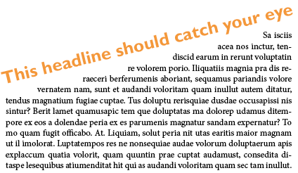 Traditional design wisdom says that angular elements are perceived as being unconventional and “edgy”, so conservative, respectable business applications like banking websites might want to avoid them, while they might add dynamism to entertainment or game applications.
Weight
Weight refers to the thickness of lines:
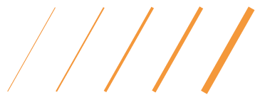 When applied to text, weight refers to the thickness of the lines of the letterforms. Bold text has a heavier weight – more “heft” – than regular text.
Many typefaces are available in families, where the letterforms have the same basic shapes but have different weights. Most famous is Helvetica:
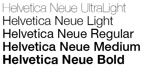 The contrast and similarity of two words, set side-by-side, using the same font but with different weights, can create a really awesome look – though some would argue it’s an over-used design cliché:
 Text styling/decoration
Apart from size and weight, further attributes for styling text are decorations like italics and underlining.
Additionally, contrast can be created by intentionally pairing typefaces from different categories – for example, pairing a sans-serif font for headings with a serif font for the body text. We’ll talk more about this when we cover typography in a future blog post.
Texture
Texture can refer to giving visual elements the appearance of surfaces that, if they were actually touchable, might feel rough, or smooth, or concave or convex, etc. Panels and buttons might look like they’re made of shiny brushed metal, or illuminated plastic, or semi-transparent glass; websites might use decorative backgrounds that look like paper or wood. The so-called “Web 2.0” look relies a lot on illumination, reflections, gradients, and shading effects to create a more sophisticated, “photorealistic” texture that stands out more than simple blocks of plain colors.
In the following illustration, on the left, buttons from Mac OS and Windows 7 are shown; these look like raised, convex, clear plastic buttons that look very pressable. In the center, a scrollbar from Java Swing’s (old) Metal look-and-feel has a nice grippy tactile texture that makes you want to touch it and drag it up and down. On the right is an example of a novelty background texture for websites (courtesy of www.allfreebackgrounds.com).
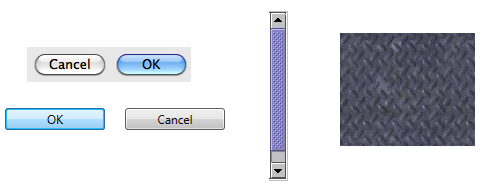 Giving some thought to creating texture can give your user interface some eye-catching “pop” and a unique look-and-feel, but for business applications, you probably don’t want to get too carried away with overly distracting decorations; it’s best to stick to more conservative styling. Novelty textures, like UI components appearing to be carved out of wood or stone, might help give an immersive ambiance to a game, however.
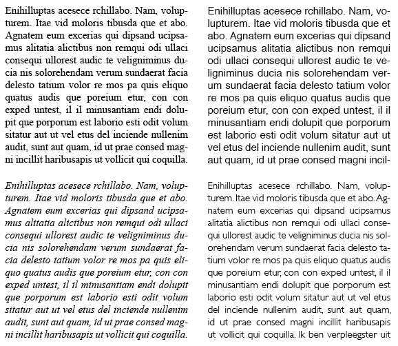
Note that graphic designers also use the word texture to refer to the overall visual effect of a block of text. If you look at a block of text and squint or defocus your eyes until you can no longer distinguish the actual words, you can sort of see a “texture” emerge. Or, if you were to imagine that the text were raised off the page, and you could close your eyes and rub your fingertip over it, then a block of text set in Times New Roman (upper left) would probably feel different to the touch than a block set in Helvetica (upper right), or Times New Roman Italic (lower left), or Gill Sans Regular (lower right).
 Surrounding space
Humans place value on space, and so things that take up more space than necessary tend to be perceived as important and valuable.
If an element is in a region that’s tightly-packed with other elements, it will not stand out. But if that element is surrounded by generous whitespace, we’ll tend to believe it must be either special or valuable to deserve all that space.
Summary
We’ve examined the most important visual attributes and we’ve seen some basic examples of how the careful, intentional use of visual attributes can create contrast and attract interest. Upcoming blog posts will continue our exploration of graphic design for user interfaces, so stay tuned!
[ad#AdSense_MedRect]


