Designing search systems

In document- and content-oriented applications and websites, the quality of the user experience often depends on the user being able to find what she is looking for, and so effective search functionality becomes critical when there is a large repository of content.

Let’s examine search systems and look at what factors you have to consider when designing one.

Searching

In a search scenario, the user enters a search query, and in response, the system retrieves matching items from a repository.

Alternatively, some people prefer to think of searching as a filtering mechanism: The user chooses filter criteria, and the system filters out any items that do not match those criteria.

When designing a search system, you need to think about and decide on the following:

  • What types of items are in the repository to be searched?  Files, documents, images, videos?  Can the search return multiple types of items?
  • What is the form of the search query?

Are there multiple fields, checkboxes, and drop-down lists that act as filter criteria?

If it is a textual search, does it search for an exact phrase match? Is it case sensitive?

Will you provide “basic” and “advanced” search interfaces to cater to different user audiences?

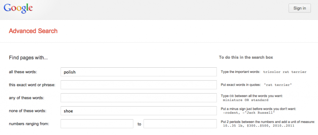
If you support features such as wildcards, regular expressions, and boolean operators (AND, OR, and NOT), how will you communicate to the user that these features are available, and where will you explain the proper syntax?  For example, Google’s Advanced Search page offers many options like these, and it simultaneously explains the syntax for the shortcuts:

  • What is the scope of the search?  For example, when searching documents, are matches for the search term sought only in the text of the document, or are metadata such as the filename, document title, document properties, and any tags searched as well?
  • Does the search attempt to find appropriate variations of the search term?  Will the technique of stemming be employed so that a search for “eat” also finds instances of inflected forms like “eats”, “eating”, and “ate”?
  • How are search results presented? When the user submits a search query, are the results presented on a separate page? Or are the results presented on the same screen and filtered in real-time as the user modifies the search criteria?

If there are many results, are the results broken up across multiple pages?

If the search results are textual documents, is a small snippet of the text surrounding the match presented to provide context? What if there are multiple matches within the same document?

  • Can users save and retrieve queries that they expect to use frequently?

Search quality

The perceived quality of search results has a big impact on the user experience. Search quality is a function of the following aspects:

  • Accuracy of recall: Search results must include all of the items that match the search criteria, and exclude any items that do not match the search criteria. If the search does not locate all of the matching items, or if irrelevant items are presented, then users can become frustrated when their expectations are not met. In some cases, users may also be misled by inaccurate search results.
  • Relevance: It’s desirable to sort the results to show the most relevant items first, although the definition of “relevance” depends on the application. Recent news articles would usually be presented ahead of older articles, for instance, and an article featuring the phrase “financial crisis” in the headline and containing multiple references to that phrase in the body would be considered more relevant than an article that mentioned that phrase only once. Users can become frustrated when they have to dig through “noisy” results to find the items that they perceive to be relevant.
  • Performance: Search results should be delivered promptly. But there is often a trade-off involved here; building performant search systems can sometimes be a very tricky and costly technical challenge.

Lookups

A specialized form of search functionality is the lookup function associated with some data-entry fields. Some fields have constraints on what values are valid, but there are too many valid values to make a drop-down list practical.

For example, a customer number field might allow the user to enter a customer number directly, but it is rare that users will have memorized the number for a particular customer, and there may be tens of thousands of customers on file. In this case, the field should provide a lookup button (or a shortcut keystroke) that allows the user to search for a customer by name. Upon selection of a customer, the customer number field is then populated with the corresponding customer number.

Finding text within a document

In document-based applications like word processors and web browsers, users will expect to be able to find all of the instances of a search term within the current document. (The generally-accepted terminology in English-language software is to “search” to locate instances of a term within a repository of documents, and to “find” to locate instances of a term within an individual document.)

For editable documents, the ability to replace instances of the search term with another term will also be expected.

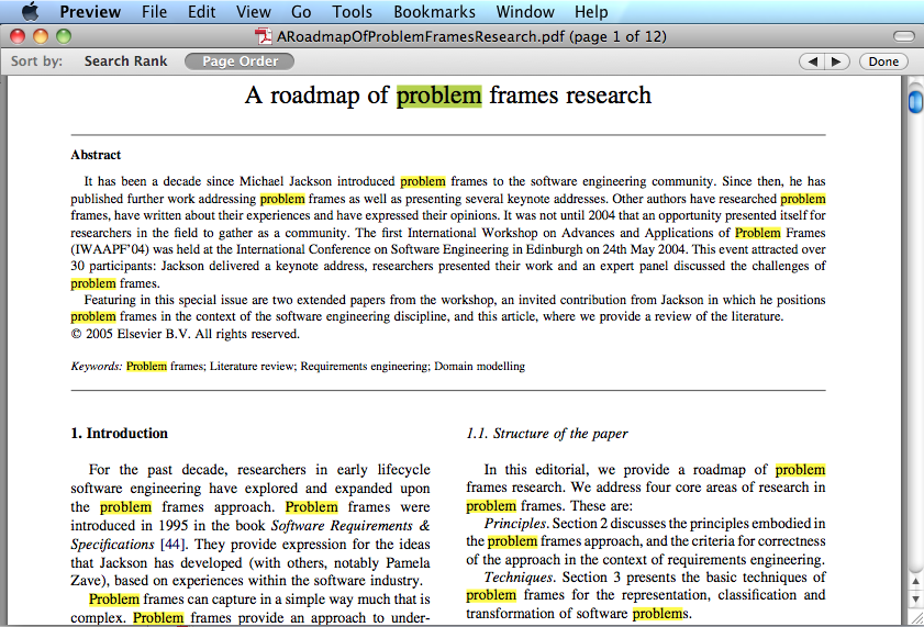
Some applications will highlight all instances of a search term within a document:

Alternatives to searching

While searching is convenient, in most applications, it should not be the only means of navigation.

In many systems, there will be some items that are accessed frequently. You might offer shortcut links, for example, to provide rapid access to the most popular items, the most recently-added items, or the user’s most recently-accessed items. Allowing the user to bookmark locations or search results may be useful as well.

We can also imagine cases where the user might prefer to browse the contents of the repository. For example:

  • the user doesn’t know what is in the repository; or,
  • the user is looking for something specific, but doesn’t know the right words to describe it; or,
  • the user has a vague idea of what they want, but it may not be easily describable in words — it’s a case of “I’ll know it when I’ll see it” (for example, the user wants to find an action photo of an athlete playing baseball, but the specific baseball player doesn’t matter as much as the general appearance and composition of the photo).

Hierarchical menus, keyword indices, and sitemaps can be useful strategies for allowing users to browse the repository and discover content.

Some systems might benefit from allowing users to tag items with keywords. Browsing the list of keywords then becomes another way of getting an overview of the repository contents and accessing items.

Some applications can take advantages of metaphors that simulate real-world situations. For example, a website for a bookstore or library might allow users to view the covers of books in various categories, providing an experience similar to browsing titles on a physical bookshelf.

Posted in Information Architecture, Interaction Design, Usability, User Experience Design | 1 Comment

Designing an interaction framework for your application’s tasks

Many applications are centered around a set of features, tasks, actions, operations, business processes, or use cases that share a similar pattern of interaction. For example:

  • A paint program has a toolbar or palette with various drawing tools. Clicking on a tool selects it, and then the user operates on the canvas with that tool until a different tool is selected.
  • A game might have a number of levels. Each level has a different map, but all of the levels have essentially the same gameplay, scoring, and success criteria for moving on to the next level.
  • A workflow-driven human resources management system might have different business processes for business events like scheduling job interviews, hiring an employee, recording employee evaluations, or adjusting employee benefits. Each business process can consist of multiple stages or subtasks that require action and approval by different users. Each business process is started by selecting it from a menu, and a business process will have an “active” status until a terminating condition is reached.

If your application has a set of similar tasks, you first will want to create a list to keep track of them.

You can then design an interaction framework that describes the commonalities of the user interface and behavior for those tasks.

Some of the issues you should consider include:

  • the means by which the tasks are started or triggered (e.g., selection from a menu);
  • the authorizations for which tasks can be initiated by which groups of users;
  • conditions under which the task can be activated, or cases where it may be disabled;
  • how the task is ended or deemed to be complete;
  • whether the initiation or end of a task changes any statuses or modes;
  • whether the end of the task leads to follow-up tasks; and
  • the effect that the task has on the data in the system; for example, upon task completion, the data may be saved persistently, whereas if the task is abandoned or cancelled, the data will not be saved. (These types of considerations can form part of the transaction/persistence concept.)

Designing an interaction framework helps ensure that you really understand how your application fundamentally works. It ensures consistency across similar tasks, which helps users perceive patterns and form correct mental models.

By documenting the commonalities amongst the tasks in an interaction framework, it also saves you from having to re-document the same aspects for each individual task. The interaction framework will also be critical for helping the development team design and build the technical “platform” on which the various tasks can be implemented.

Posted in Information Architecture, Interaction Design, Uncategorized, Usability, User Experience Design | Leave a comment

How to build a visual hierarchy to express relationships between page elements

The underlying structure of a page’s layout can be understood as a visual hierarchy, where some visual elements on the page are subordinate to others. The visual hierarchy helps guide the user’s eye through the page, and aids users in interpreting the content of the page by giving clues to the relationships amongst the elements.

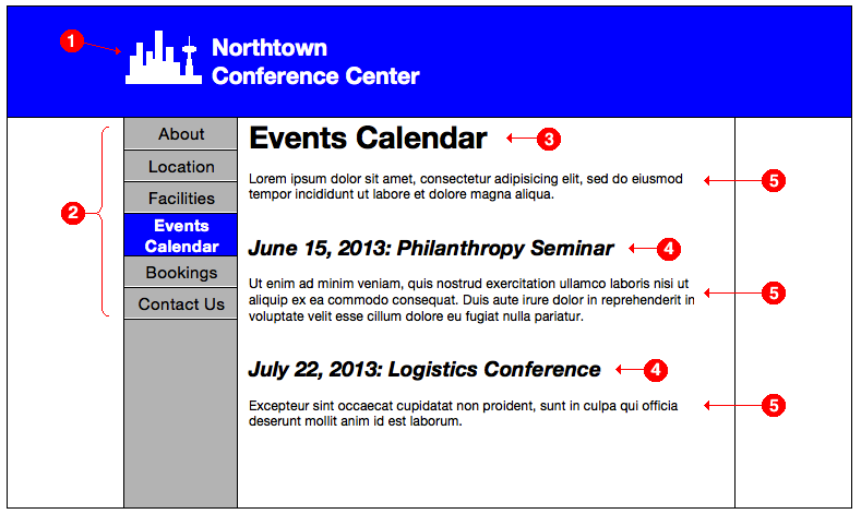
Take this page for example:

The banner is the highest element in the hierarchy of this page. The banner and logo tell the viewer that everything on the page is associated with the site named in the banner.

The navigation bar on the left-hand side of the page comes second in the visual hierarchy.

The main content panel’s heading, “Events Calendar”, which describes the contents that follow, forms the third element in the visual hierarchy.

The two subheadings are subordinate to the main heading, so they come next in the visual hierarchy.

Finally, the sections of body text are subordinate to their respective headings. These come last in the visual hierarchy.

When scanning the page, the viewer’s eye will tend to look first at the banner, then move to the navigation sidebar, then the main heading. While the viewer may read the content under the main heading from top to bottom, it is likely that the viewer’s eye will be caught by the subheadings first, and then the viewer’s eye may go back to read the body text.

The visual hierarchy helps the viewer interpret the content on the page in a logical way. Let’s now take a closer look at how create a visual hierarchy and express relationships between different elements on the page.  Our main tools for achieving this are the use of similar or contrasting visual attributes of elements, and the relative positioning of elements.

Attributes

Attributes are the general properties of things on the page. Common attributes are size, shape, color, texture, and direction. For text, attributes include the typeface, weight, spacing, and decorations such as italicization or underlining. In other words, attributes are ways to style a visual element.

Visual elements that are similar or belong to the same category should share the same attributes, whereas elements that are intended to be different should have one or more contrasting attributes. If one element is intended to be stronger or more important than the other element, then the attributes should be chosen to reflect that.

For example, if you have a list or a menu, then all of the entries belong to the same class or category of elements, and so they should be styled consistently with the same attributes. But the heading that sits atop the list serves a different function. It describes or summarizes the contents of the list or menu, and so it should be styled with contrasting attributes that emphasize its dominance. The heading might be larger or bolder, or it may take a different typeface or color.

Contrast is weak when the elements being contrasted are only slightly different. When two element differ only slightly, it can often look like the difference was made by accident. Strong contrast is produced when the differences are clearly intentional. To create intentional contrast between two elements, the general guideline is to make sure the elements differ in at least two ways; that is, at least two attributes should be different between the elements.

For the purposes of this guideline, surrounding space is often considered to be an attribute as well, so leaving a gap of whitespace between two elements can count as one of the differences.

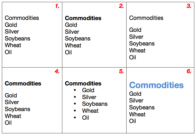
The following diagram shows some examples of weak contrast and strong contrast between a heading and a list of items:

In example (1), there are no differences between the heading “Commodities” and the entries in the list, so it does not look like a heading at all.

Example (2) is better — the heading is in bold type — but the difference still does not stand out strongly.

Example (3) places a gap between the heading and the list. While this is also better than (1), it is still not satisfying, as the heading is set in the same type as the list entries.

Examples (4) through (6) illustrate how using two differences produces much stronger visual contrast. Example (4) uses a gap and sets the heading in bold type. Example (5) sets the heading in bold type and uses indented bullets to offset the list from the heading. Example (6) increases the size of the heading’s font and sets the heading in a different color.

The latter three examples communicate the relationship between the heading and the list entries much more effectively than do the first three examples.

Positioning

In the English-speaking world, and in other left-to-right languages, we read from left-to-right and from top-to-bottom. What is at the top of the page is considered to be more important than what is at the bottom of the page, and to a lesser extent, things on the left in a row of things are perceived to come first. (In right-to-left languages like Arabic and Hebrew, the right-to-left direction is reversed.)

Thus, the top-left corner of the page is where the eye begins when scanning the page, and so the most important element in the visual hierarchy is usually placed there.

If we have two visual elements A and B, we should ensure that A is positioned either above, or to the left of, element B, when we want to show that:

  • Element A is more important than element B; or,
  • Element B is a subelement of A; or,
  • Element B depends on, logically follows from, or derives from, element A; or,
  • Element A is the cause and B is the effect; or
  • Element B naturally follows A in a logical sequence.

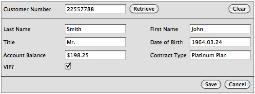
As an example, let’s take one example of poor design that I’ve encountered. One system had a screen for editing customer details that looked roughly like this:

Users were expected to enter a value in the Customer Number field and then click Retrieve. The other fields on the screen would then be populated with the data on file for that particular customer.

The above design is poor because the relationship between the customer number and the remaining fields is not communicated by the visual design.

The data on this screen is dependent on the customer number, because the customer number is the identifying piece of information, or key, for a customer record. If the user enters a new customer number and clicks Retrieve, new data for the new customer number will be presented.

But because the user will start reading the screen from the top left, the user might assume that the last name and first name are identifying the customer record. Additionally, the fact that the user is expected to locate the Customer Number field first is troubling; it is buried deep in the screen, and there are no visual cues that it is the most important element upon which the others are dependent. If it is the identifying field upon which the other fields depend, then it should be situated in a place that better communicates its importance: the upper left, where the user begins scanning the screen.

And the fact that the user has to jump from the Customer Number field up to the Retrieve button is poor design as well. There are no cues that this is how the interaction flow is supposed to work; because we read from left-to-right and from top-to-bottom, jumping from below to above is counterintuitive. The button should be moved so that there is a left-to-right or top-to-bottom flow from the Customer Number field to the Retrieve button.

Thus, one possibility for an improved layout might be something like the following:

In this design, it is clearer that the details are dependent upon the chosen customer number. There is a left-to-right flow from the Customer Number field to the Retrieve button, and there is top-to-bottom flow that leads towards the finalizing Save and Cancel buttons.

Practical aspects of visual hierarchy for user interface design

While you may not necessarily explicitly design a visual hierarchy when creating a page composition, an awareness of the general concept of the visual hierarchy and an understanding of how relationships between elements can be expressed can help you produce better designs.

In large project teams, you can try to ensure some degree of visual design consistency throughout your product by creating a style guide that defines the general look-and-feel of the interface in terms of a visual hierarchy. Writing a style guide is not always easy; it’s not always possible to completely document everything that makes up a consistent set of visual designs. But by specifying rules for the styles and positioning of headings and other visual elements, and by providing page layout templates and examples, a style guide can help communicate your design intentions to your project team.

Posted in Information Architecture, Interaction Design, Psychology for UX Design, Usability, User Experience Design, Visual Design | 1 Comment

Interaction design and usability for data persistence and transactions

Most applications deal with data that needs to be stored persistently — that is, saved — so that it can be accessed later. A “persistence concept” or “transaction concept” is an explanation, at the user-interface level, of how this works in your application.

To help us understand what’s involved in interaction design for persistence and transactions, let’s first look at how data is saved in two typical classes of applications: document-oriented desktop apps, and multi-user web and client-server apps.

Document-oriented desktop applications

For document-oriented desktop applications, like word processors and spreadsheets, documents are usually saved as individual files on a disk.

When a user is working with a such an application, there is a copy of the document stored in the working memory of the user’s computer. As the user edits the document, the copy in working memory is modified, and so it will no longer match the copy on disk. By saving the document, the copy on disk will be updated to match the copy in working memory. If the user makes changes to the document and then closes the document or closes the application without saving the document, then the changes will be lost.

Most people with computing experience are familiar with this model. You can indicate that your application uses this model by following standard conventions (which can vary between platforms). There should be “Save” and “Save As…” commands under the File menu, and (especially on Windows) there may be a “Save” icon in the toolbar. On Mac OS X, a black dot appears in the red “Close Window” button whenever unsaved changes are present, and this dot disappears after the document has been saved. On Windows, some applications place an asterisk next to the document title in the window’s title bar when unsaved changes are present.

The dot in the red "Close Window" button indicates unsaved changes are present

Some usability specialists argue that the need to know about the separation between working memory and persistent storage is a “leaky abstraction” — an underlying aspect of the technology that is exposed to the user, creating an unnecessary mental burden. The Canon Cat was a unique word processing system in the 1980’s that hid the distinction between working memory and persistent storage. No “Save” command was offered because the system automatically synchronized all changes with the copy on disk. The popular word processing application Scrivener similarly saves all changes automatically every few seconds, meaning that users never have to worry about explicitly saving their work. Diverting from the conventional way of doing things can initially cause users confusion, though, and so Scrivener still offers a “Save” command in the File menu for convenience, even though it’s never really necessary.

Web and client-server applications

For most web applications and client-server applications, data is usually stored in a database (which in turn stores the data in files on a disk). Database systems allow many different users to access the same data simultaenously.

In applications that are backed by a database, when a user creates, edits, or deletes data in the system, these changes can be accumulated in units called transactions. If other users of the system retrieve data from the database while the first user’s transaction is still in progress, the other users will not see these changes. But when the software issues a “commit” command for the first user’s transaction, the transaction is ended, and the user’s accumulated pending changes are saved “permanently” to the database so that other users of the system can see the user’s changes.

If instead a “rollback” command is issued, the transaction is also ended, but all of the pending changes for that user’s transaction are cancelled, and the database is not updated; other users see no changes in the data in the database.

Most applications hide the technical concepts of transactions, commits, and rollbacks from the user. This hiding is done by aligning the start and end of transactions with places in the user interface where various events or task flows start and end. Terminology is also used that is more familiar to the user.

For example, we can image that when a dialog box such as a Properties dialog is opened, a transaction will be started. If the user closes the dialog or presses the “Cancel” button, then the transaction will be rolled back and any changes the user had made in the dialog will be lost. If the user presses the “OK” button, the user’s changes in the dialog will be committed to the database.

For multi-user systems, you also need to think about what happens when two users try to edit the same information records simultaneously.

Imagine a situation where two users are attempting to make changes to the address information on file for a particular customer. The original address on file is “123 Main Street”. User A opens the address record and starts changing “123 Main Street” to “456 First Ave.”, while seconds later, User B opens the same address record and starts changing “123 Main Street” to “789 Second Ave.” If User A presses the “OK” button to save the changes, and then User B presses the “OK” button shortly afterwards, what happens to the data on file? There are a couple of possibilities:

  • User A’s changes get saved, but then User B’s changes overwrite User A’s changes. So the address on file at the end is “789 Second Ave.”
  • User A’s changes get saved, but User B’s changes are ignored because User A was first.

Neither of these is particularly satisfying, as both users will think that their changes have been saved, but one user will have had their changes overwritten or lost without their knowledge.

One solution to this issue is to use some form of record locking: When User A opens the customer record, the system locks that record, so that if User B attempts to open the same record, she receives a message that the record is locked and unavailable for editing. When User A commits or rolls back his changes, then the lock is removed and the other users can edit the record again. One problem with locks is that if User A leaves his terminal and goes home, or if User A’s application or operating system crashes, the lock might be “stuck” in place for a long time, requiring an administrator to intervene so that other users can edit the record again.

In many applications, it makes sense to want to allow multiple users to view the same record simultaneously, but only one user at a time should be able to edit the data. This raises the question of whether users who are viewing a record should be notified when the data they are viewing has been changed by another user. If there is no notification and if the display is not automatically refreshed, the user will be looking at “stale” data that was at one time correct, but no longer matches the current state of the database, and this may or may not be a problem depending on the nature of the application.

Collaborative web-based applications where users work together on editing the same document can present many challenges like these, and it can take some creative thinking to find usable and non-intrusive solutions to avoid or manage simultaenous editing conflicts.

Designing and documenting a transaction and persistence concept

We’ve seen that an application’s learnability and usability can be impacted by how it handles the persistence of data and manages multi-user editing conflicts, and how the persistence model is presented via the user interface and interaction design. Therefore, explicitly designing how these aspects will work from a user’s standpoint is a good idea for applications of significant complexity.

Questions you need to ask and eventually make decisions about include:

  • What types of data validations take place, and when is the validation performed? How are errors and warnings presented?
  • Can data or documents be saved when validation errors exist or when mandatory fields are empty?
  • At what points in the application can data be saved? How and when can any changes be lost (intentionally or unintentionally)?
  • If the system uses transactions, where do transactions begin and end?
  • Does the application save data automatically, or does it rely on the user to use some form of “Save” or “Commit” command? Are controls such as “Save” menu options or toolbar buttons prominently visible, and is it clear to the user how and when to use them?
  • How is the user interface structured to help user understand the persistence or transaction model? Is the state of the data (saved or unsaved) made clear?

You’ll often need to clarify some of these questions with the technical architects and developers in your project, as the technology framework being used can often dictate how some of these aspects will have work. At the same time, just because the technology requires things to be done in a certain way does not necessarily mean that you have to expose all of the details to the user; technical details can be hidden. Whenever possible, create the design that is clearest and easiest for the user, and then build the system to support that way of working.

Posted in Information Architecture, Interaction Design, Usability, User Experience Design, Visual Design | 1 Comment

Designing navigation and wayfinding in software applications and websites

To make your application or website easy to use, you need to make it easy for users to navigate. That means that users have to be able to understand:

  • where they currently are,
  • where they can go, and
  • how to get to where they want to go.

Designing how navigation and wayfinding works is a key aspect of your application’s information architecture. Let’s find out what you need to consider to design navigation effectively.

In this post, we’ll use “places” as a general term to refer to locations or containers that can present content and controls, because these can have different names depending on the context. For instance:

  • In a web application, places usually correspond to different pages.
  • In a mobile or tablet application, places typically correspond to different screens or pages.
  • In a desktop application, places might be screens, windows, or dialog boxes.

“Places” could also refer to divisions such as panels, tabs, and subsections within a page, screen, or window.

Identification of places using names or titles

When your application has multiple places, each place should be clearly labelled with a title, so that the user can determine what place she is currently looking at. Assigning each place a title then allows you to refer to it in menus and in instructions and help text.

Examples of titles include a “Find and Replace” dialog, a “Departure Schedule” page on an airport website, or a “Level 5″ in a video game. Some places might have user-assigned names; for instance, in many document-oriented applications, the title of a window or tab will be the filename of the document being displayed there.

Some guidelines on naming are given in this blog post.

Presentation of places

Depending on the type of application, you may need to think about some of the following questions:

  • Can the user view only one place at once? (Most mobile and table applications work this way.)
  • Can the user have multiple places open at once, such as multiple documents in a word processor, multiple sheets in a spreadsheet, or multiple tabs in a web browser? How will you indicate which is the current “active” or “focused” place?
  • If applicable, can the “places” be resized and rearranged?
  • Can the content in different places be interrelated, and if so, how and when will changing content in one place affect the other places? For instance, in the Eclipse programming environment, if a programmer makes a coding error, the error will be detected almost instantly and a notice will appear in the “Problems” view panel. Or in a spreadsheet, changing a value on one sheet can cause recalculations that affect other related sheets.

Navigation map

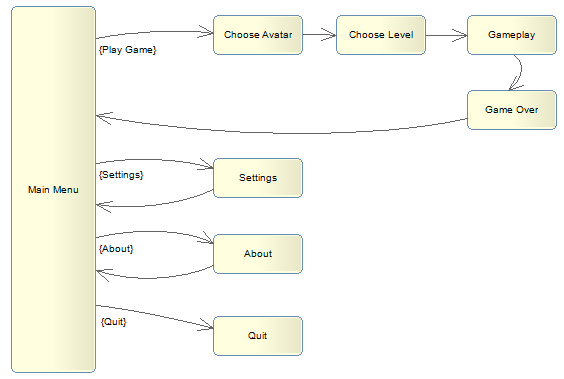
You may want to sketch a navigation map to keep track of how users can move from one place to another. For instance, a simple game may have several screens that are accessible from a main menu screen:

Navigation map for a simple game

Navigation maps aren’t relevant or useful for all types of application, however, and there are many cases where drawing a complete map is impractical or impossible. In a wiki application, for instance, users can create new pages and interlink them however they like.

Navigation mechanisms

The following list explains some of the means by which the user might be able to navigate between different places. Most applications will use some combination of several of these.

  • Menus: Navigation menus on websites direct users to other pages. Pull-down menus in desktop applications often open pop-up dialogs.
  • Hypertext links: On websites, users can navigate to other pages by means of hypertext links.
  • Buttons: Clicking or pressing a button or a similar control might cause the application to switch to another place. For example, clicking on a “Next” button will take you to the next step in a wizard. Toolbar buttons often open pop-up dialogs.
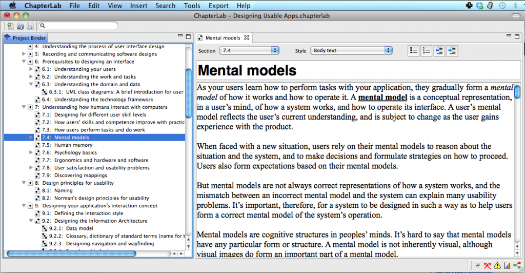
  • Hierarchical trees: Many applications split the display into two panels; in the left-hand panel, a hierarchical tree control is presented. When an item or object is selected in the tree, the right-hand panel displays the contents of the selected item or object.

Hierarchical tree as a navigation mechanism in ChapterLab


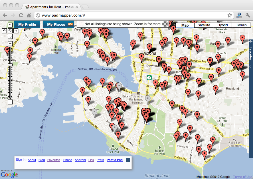
  • Map: Some applications might present a clickable or touchable geographical map. PadMapper, for instance, shows apartments listings on a city map; selecting a pinpoint pops up more information on each listing.

PadMapper uses a map as a navigation aid


  • Process flow diagram: The main screen in QuickBooks is a diagram depicting the flow of accounting documents and processes. Selecting an icon in the diagram opens a window appropriate to each type of document or process.

Process flow diagram in QuickBooks


  • Switching: If multiple places or documents are open at once, the user should be able to switch between them easily and rapidly.
  • Task flow: Place changes can be triggered by the completion of a task. For example, upon successful completion of a purchase on an e-commerce site, the user may be taken to page showing an order confirmation.
  • Events: An event triggered by the application itself, or by an input from an external system, could cause a pop-up dialog to appear. For instance, a reminder pop-up may appear at a specific time controller by a timer. In a stock trading application, an alert might pop up if a security’s price goes above or below a specified limit.
  • Searching: Many applications allow the user to search for a keyword. Selecting a search result then takes the user to the appropriate document or place.
  • Bookmarks and flags: Some applications, like web browsers and e-book readers, allow users to bookmark pages or flag specific locations for later access.
  • History: Some applications provide a chronological list of recently-accessed places. All web browsers have some form of history list and offer Back and Forward buttons for navigating through the history list. Similarly, most Mac applications offer an “Open Recent” menu option offering quick access to recently-opened files.

“You are here” indication

The more complex the navigation is and the more places there are in your application, the more important it is to clearly show the user where she currently is. Some ways you can indicate the current location are:

  • Conspicuously presenting the title of the place
  • Highlighting the current location in a visual map or process flow diagram
  • Highlighting the current item or object in a hierarchical tree control

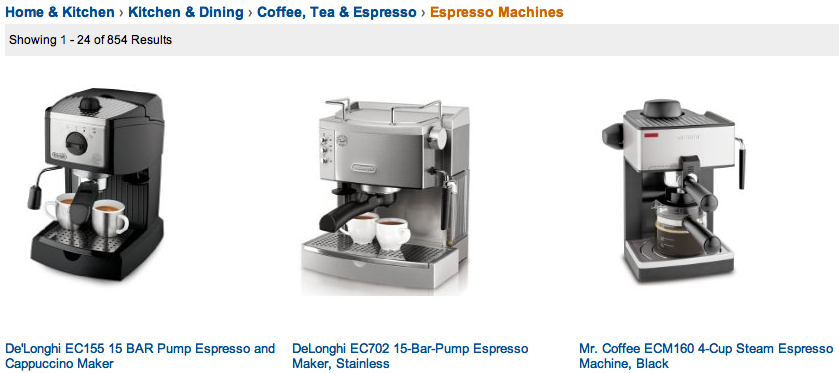
For websites that organize content in a hierarchical fashion, the “breadcrumb” technique is simultaneously a location indicator and a means of navigation. As shown in the following example from Amazon.com, the breadcrumb lists the categories in the hierarchy that you would need to navigate through in order to get to the final destination, and each of these categories is a clickable link:

Example of breadcrumb navigation on an e-commerce site


Posted in Information Architecture, Interaction Design, Usability, User Experience Design, Visual Design | Leave a comment

Designing your application’s interaction concept

Your application’s interaction concept is a basic summary or description of the fundamental way the user interface works. It describes the general way that users interact with the application to complete their tasks.

Because usability problems tend to emerge when key issues like navigation, workflow, and transactions haven’t been thought all the way through, it is worthwhile spending time on thinking about these issues and explicitly designing and evaluating solutions.

Not everything can or should be decided at the very beginning; preliminary decisions will often have to be made which can then be changed or refined as the project goes on. However, some fundamental things are very hard to change once product development is in full swing, and so these things — what we might call the architectural design — should receive special attention early on in the project.

It is possible to describe an interaction concept in a formal specification document, and for large teams building large products, this can be a reasonable approach for recording and communicating the design to team members. But creating a formal deliverable is not the point, and nor is it the only way to document and communicate design decisions. Writing a specification is good if it forces the team to think through and decide on key issues, but a formal document can be difficult to write because many things, like the visual design, are very difficult to specify completely and accurately in writing.

A more agile approach that tends to be more successful is prototyping, in combination with some minimal, agile documentation. Prototyping can be a very effective way of trying out different design ideas and getting feedback through peer reviews and usability testing. A prototype alone cannot capture and communicate all of the design decisions and rationale, though, so lightweight written records can be used to supplement it.

What kinds of issues make up the interaction concept?

  • A choice of one or more interaction styles
  • The basics of the information architecture, which may include:
    • Data model
    • Behavioral model
    • Glossary of preferred names
    • Navigation and wayfinding
    • Search and indexing
  • A framework for interactions and workflow
  • A transaction and persistence concept
  • A visual design framework (essentially, the product-wide look-and-feel)

We’ll examine each of these in upcoming blog posts.

Posted in Information Architecture, Interaction Design, Product Management, Requirements Engineering, Usability, User Experience Design, Visual Design | Leave a comment