In Part 1 and Part 2 of this series, we looked at how readers look at pages or screens and what typical paths a reader’s eye follows when scanning visual information.
When designing a software application or website, if want to try to intentionally direct our users’ attention to something, or at least influence their eye movements when they look at a page, there are some tricks we can use:
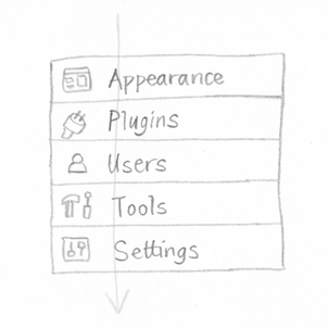
- A list of similar elements (like site navigation buttons) in a row or column will usually draw the reader’s eye down the list, if it is vertical, or across, if it is horizontal. If the list is long, the entries at the beginning and end are more likely to be noticed and read than the ones in the middle.
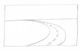
- If the page is dominated by a large, curved, sweeping line or shape, the reader’s eye will typically follow that curve.
- Arrows and pointy shapes can direct the reader’s eye towards something. Likewise, if you have pictures of people looking or pointing at something, the reader will naturally gravitate to look at the object of attention.
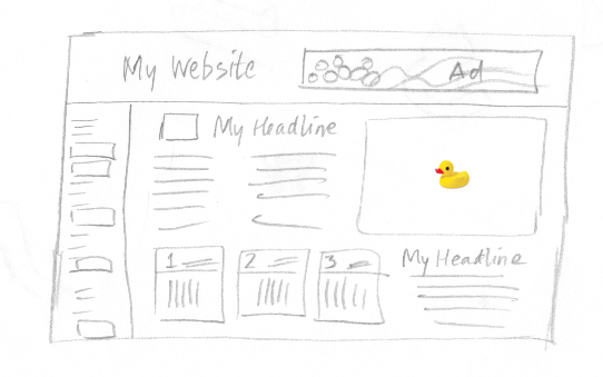
- The best way to attract the viewer’s attention to something is to create contrast. Make the target element different from the things surrounding it:
- A photo or graphic will stand out in a sea of text.
- On a page dominated by vertical and horziontal lines and boxes, anything diagonal or tilted will attract attention.
- If a page is crowded with content, but there is an open area where an object is surrounded by generous whitespace, then the reader’s eye will gravitate towards the open empty space and the object within it.
- A splash of color in a sea of black-and-white or grey attracts attention to itself; a brighter, intense color will stand out amongst more subdued colors (like yellow on blue).
 Knowing a bit about how users scan and read pages and screens puts us in a better position to be able to design good screen layouts. We’ll talk about page composition and visual design techniques in upcoming posts.
[ad#AdSense_Banner]


