The underlying structure of a page’s layout can be understood as a visual hierarchy, where some visual elements on the page are subordinate to others. The visual hierarchy helps guide the user’s eye through the page, and aids users in interpreting the content of the page by giving clues to the relationships amongst the elements.
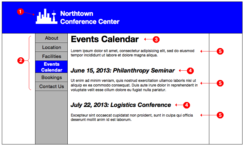
Take this page for example:
The banner is the highest element in the hierarchy of this page. The banner and logo tell the viewer that everything on the page is associated with the site named in the banner.
The navigation bar on the left-hand side of the page comes second in the visual hierarchy.
The main content panel’s heading, “Events Calendar”, which describes the contents that follow, forms the third element in the visual hierarchy.
The two subheadings are subordinate to the main heading, so they come next in the visual hierarchy.
Finally, the sections of body text are subordinate to their respective headings. These come last in the visual hierarchy.
When scanning the page, the viewer’s eye will tend to look first at the banner, then move to the navigation sidebar, then the main heading. While the viewer may read the content under the main heading from top to bottom, it is likely that the viewer’s eye will be caught by the subheadings first, and then the viewer’s eye may go back to read the body text.
The visual hierarchy helps the viewer interpret the content on the page in a logical way. Let’s now take a closer look at how create a visual hierarchy and express relationships between different elements on the page. Our main tools for achieving this are the use of similar or contrasting visual attributes of elements, and the relative positioning of elements.
Attributes
Attributes are the general properties of things on the page. Common attributes are size, shape, color, texture, and direction. For text, attributes include the typeface, weight, spacing, and decorations such as italicization or underlining. In other words, attributes are ways to style a visual element.
Visual elements that are similar or belong to the same category should share the same attributes, whereas elements that are intended to be different should have one or more contrasting attributes. If one element is intended to be stronger or more important than the other element, then the attributes should be chosen to reflect that.
For example, if you have a list or a menu, then all of the entries belong to the same class or category of elements, and so they should be styled consistently with the same attributes. But the heading that sits atop the list serves a different function. It describes or summarizes the contents of the list or menu, and so it should be styled with contrasting attributes that emphasize its dominance. The heading might be larger or bolder, or it may take a different typeface or color.
Contrast is weak when the elements being contrasted are only slightly different. When two element differ only slightly, it can often look like the difference was made by accident. Strong contrast is produced when the differences are clearly intentional. To create intentional contrast between two elements, the general guideline is to make sure the elements differ in at least two ways; that is, at least two attributes should be different between the elements.
For the purposes of this guideline, surrounding space is often considered to be an attribute as well, so leaving a gap of whitespace between two elements can count as one of the differences.
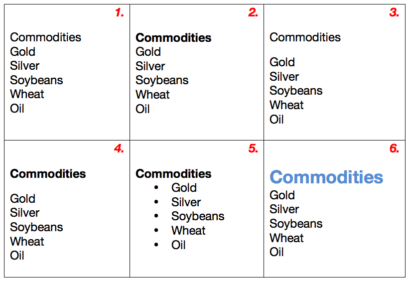
The following diagram shows some examples of weak contrast and strong contrast between a heading and a list of items:
In example (1), there are no differences between the heading “Commodities” and the entries in the list, so it does not look like a heading at all.
Example (2) is better — the heading is in bold type — but the difference still does not stand out strongly.
Example (3) places a gap between the heading and the list. While this is also better than (1), it is still not satisfying, as the heading is set in the same type as the list entries.
Examples (4) through (6) illustrate how using two differences produces much stronger visual contrast. Example (4) uses a gap and sets the heading in bold type. Example (5) sets the heading in bold type and uses indented bullets to offset the list from the heading. Example (6) increases the size of the heading’s font and sets the heading in a different color.
The latter three examples communicate the relationship between the heading and the list entries much more effectively than do the first three examples.
Positioning
In the English-speaking world, and in other left-to-right languages, we read from left-to-right and from top-to-bottom. What is at the top of the page is considered to be more important than what is at the bottom of the page, and to a lesser extent, things on the left in a row of things are perceived to come first. (In right-to-left languages like Arabic and Hebrew, the right-to-left direction is reversed.)
Thus, the top-left corner of the page is where the eye begins when scanning the page, and so the most important element in the visual hierarchy is usually placed there.
If we have two visual elements A and B, we should ensure that A is positioned either above, or to the left of, element B, when we want to show that:
- Element A is more important than element B; or,
- Element B is a subelement of A; or,
- Element B depends on, logically follows from, or derives from, element A; or,
- Element A is the cause and B is the effect; or
- Element B naturally follows A in a logical sequence.
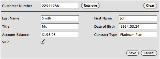
As an example, let’s take one example of poor design that I’ve encountered. One system had a screen for editing customer details that looked roughly like this:
Users were expected to enter a value in the Customer Number field and then click Retrieve. The other fields on the screen would then be populated with the data on file for that particular customer.
The above design is poor because the relationship between the customer number and the remaining fields is not communicated by the visual design.
The data on this screen is dependent on the customer number, because the customer number is the identifying piece of information, or key, for a customer record. If the user enters a new customer number and clicks Retrieve, new data for the new customer number will be presented.
But because the user will start reading the screen from the top left, the user might assume that the last name and first name are identifying the customer record. Additionally, the fact that the user is expected to locate the Customer Number field first is troubling; it is buried deep in the screen, and there are no visual cues that it is the most important element upon which the others are dependent. If it is the identifying field upon which the other fields depend, then it should be situated in a place that better communicates its importance: the upper left, where the user begins scanning the screen.
And the fact that the user has to jump from the Customer Number field up to the Retrieve button is poor design as well. There are no cues that this is how the interaction flow is supposed to work; because we read from left-to-right and from top-to-bottom, jumping from below to above is counterintuitive. The button should be moved so that there is a left-to-right or top-to-bottom flow from the Customer Number field to the Retrieve button.
Thus, one possibility for an improved layout might be something like the following:
In this design, it is clearer that the details are dependent upon the chosen customer number. There is a left-to-right flow from the Customer Number field to the Retrieve button, and there is top-to-bottom flow that leads towards the finalizing Save and Cancel buttons.
Practical aspects of visual hierarchy for user interface design
While you may not necessarily explicitly design a visual hierarchy when creating a page composition, an awareness of the general concept of the visual hierarchy and an understanding of how relationships between elements can be expressed can help you produce better designs.
In large project teams, you can try to ensure some degree of visual design consistency throughout your product by creating a style guide that defines the general look-and-feel of the interface in terms of a visual hierarchy. Writing a style guide is not always easy; it’s not always possible to completely document everything that makes up a consistent set of visual designs. But by specifying rules for the styles and positioning of headings and other visual elements, and by providing page layout templates and examples, a style guide can help communicate your design intentions to your project team.


Pingback: How to build a visual hierarchy to express relationships between page elements #ux #usability #ixd #webdesign | UXWeb.info