To make your application or website easy to use, you need to make it easy for users to navigate. That means that users have to be able to understand:
- where they currently are,
- where they can go, and
- how to get to where they want to go.
Designing how navigation and wayfinding works is a key aspect of your application’s information architecture. Let’s find out what you need to consider to design navigation effectively.
In this post, we’ll use “places” as a general term to refer to locations or containers that can present content and controls, because these can have different names depending on the context. For instance:
- In a web application, places usually correspond to different pages.
- In a mobile or tablet application, places typically correspond to different screens or pages.
- In a desktop application, places might be screens, windows, or dialog boxes.
“Places” could also refer to divisions such as panels, tabs, and subsections within a page, screen, or window.
Identification of places using names or titles
When your application has multiple places, each place should be clearly labelled with a title, so that the user can determine what place she is currently looking at. Assigning each place a title then allows you to refer to it in menus and in instructions and help text.
Examples of titles include a “Find and Replace” dialog, a “Departure Schedule” page on an airport website, or a “Level 5″ in a video game. Some places might have user-assigned names; for instance, in many document-oriented applications, the title of a window or tab will be the filename of the document being displayed there.
Some guidelines on naming are given in this blog post.
Presentation of places
Depending on the type of application, you may need to think about some of the following questions:
- Can the user view only one place at once? (Most mobile and table applications work this way.)
- Can the user have multiple places open at once, such as multiple documents in a word processor, multiple sheets in a spreadsheet, or multiple tabs in a web browser? How will you indicate which is the current “active” or “focused” place?
- If applicable, can the “places” be resized and rearranged?
- Can the content in different places be interrelated, and if so, how and when will changing content in one place affect the other places? For instance, in the Eclipse programming environment, if a programmer makes a coding error, the error will be detected almost instantly and a notice will appear in the “Problems” view panel. Or in a spreadsheet, changing a value on one sheet can cause recalculations that affect other related sheets.
Navigation map
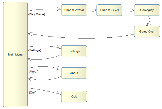
You may want to sketch a navigation map to keep track of how users can move from one place to another. For instance, a simple game may have several screens that are accessible from a main menu screen:
Navigation maps aren’t relevant or useful for all types of application, however, and there are many cases where drawing a complete map is impractical or impossible. In a wiki application, for instance, users can create new pages and interlink them however they like.
Navigation mechanisms
The following list explains some of the means by which the user might be able to navigate between different places. Most applications will use some combination of several of these.
- Menus: Navigation menus on websites direct users to other pages. Pull-down menus in desktop applications often open pop-up dialogs.
- Hypertext links: On websites, users can navigate to other pages by means of hypertext links.
- Buttons: Clicking or pressing a button or a similar control might cause the application to switch to another place. For example, clicking on a “Next” button will take you to the next step in a wizard. Toolbar buttons often open pop-up dialogs.
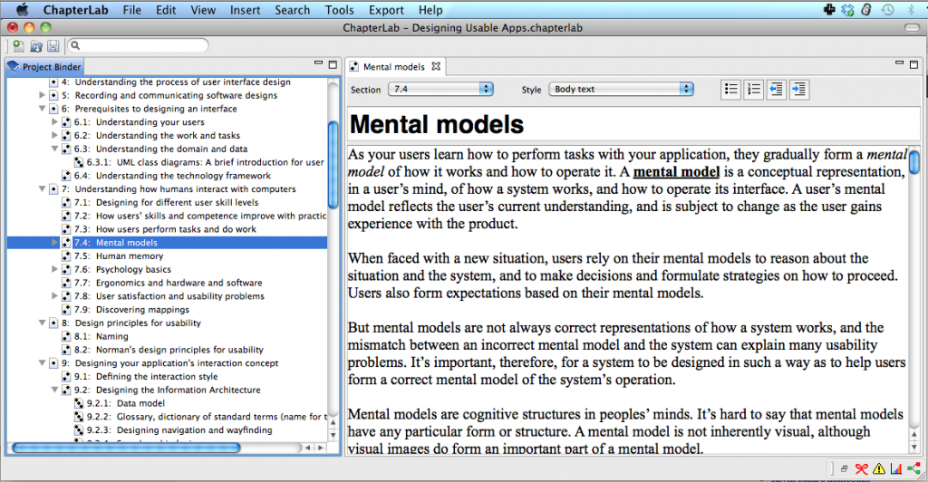
- Hierarchical trees: Many applications split the display into two panels; in the left-hand panel, a hierarchical tree control is presented. When an item or object is selected in the tree, the right-hand panel displays the contents of the selected item or object.
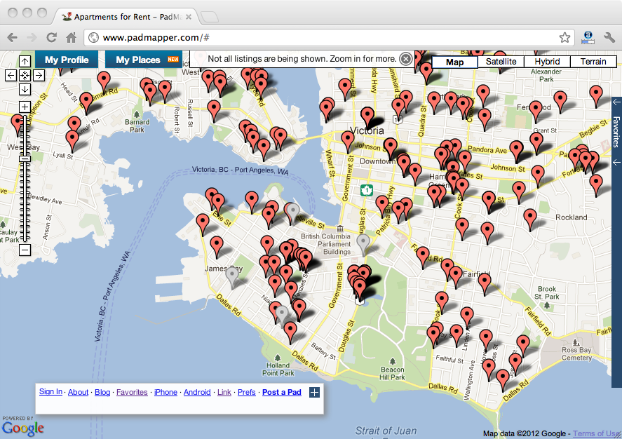
- Map: Some applications might present a clickable or touchable geographical map. PadMapper, for instance, shows apartments listings on a city map; selecting a pinpoint pops up more information on each listing.
- Process flow diagram: The main screen in QuickBooks is a diagram depicting the flow of accounting documents and processes. Selecting an icon in the diagram opens a window appropriate to each type of document or process.
- Switching: If multiple places or documents are open at once, the user should be able to switch between them easily and rapidly.
- Task flow: Place changes can be triggered by the completion of a task. For example, upon successful completion of a purchase on an e-commerce site, the user may be taken to page showing an order confirmation.
- Events: An event triggered by the application itself, or by an input from an external system, could cause a pop-up dialog to appear. For instance, a reminder pop-up may appear at a specific time controller by a timer. In a stock trading application, an alert might pop up if a security’s price goes above or below a specified limit.
- Searching: Many applications allow the user to search for a keyword. Selecting a search result then takes the user to the appropriate document or place.
- Bookmarks and flags: Some applications, like web browsers and e-book readers, allow users to bookmark pages or flag specific locations for later access.
- History: Some applications provide a chronological list of recently-accessed places. All web browsers have some form of history list and offer Back and Forward buttons for navigating through the history list. Similarly, most Mac applications offer an “Open Recent” menu option offering quick access to recently-opened files.
“You are here” indication
The more complex the navigation is and the more places there are in your application, the more important it is to clearly show the user where she currently is. Some ways you can indicate the current location are:
- Conspicuously presenting the title of the place
- Highlighting the current location in a visual map or process flow diagram
- Highlighting the current item or object in a hierarchical tree control
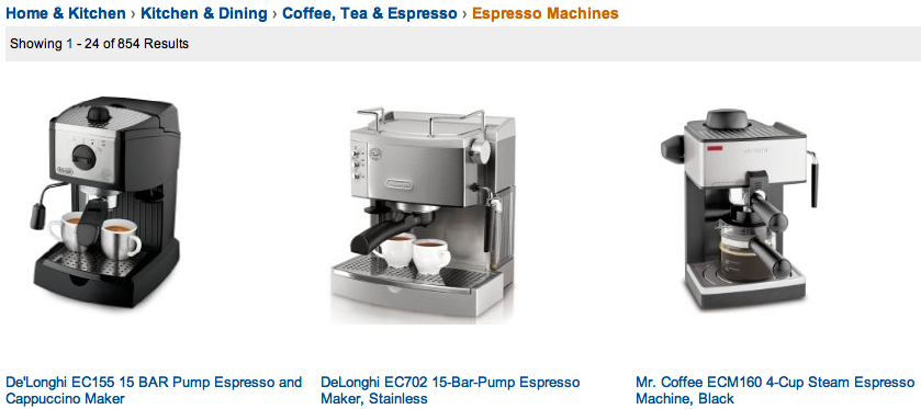
For websites that organize content in a hierarchical fashion, the “breadcrumb” technique is simultaneously a location indicator and a means of navigation. As shown in the following example from Amazon.com, the breadcrumb lists the categories in the hierarchy that you would need to navigate through in order to get to the final destination, and each of these categories is a clickable link:


