Designing a user interface for a non-trivial product is a complex task.
One traditional approach to designing and building software products was the waterfall model, where requirements are first gathered and written up in specifications documents. These are then handed off to designers, who create designs and write design specifications. These are then handed off to developers, who build the product. The product is finally handed off to testers, who verify that the product matches the specifications.
This sounds fine in theory — it’s a very logical, rational decomposition — but for large, complex products, this approach never really seems to work very efficiently. For complex projects, it’s never possible for analysts and designers and programmers to get everything correct and complete on the first try, and so waterfall projects inevitably tend to break down into a chaotic scene of documents being passed back and forth between groups for correction. And since software projects span months or years, it’s very frequent that the requirements will change during the course of the project, meaning that by the time the product is finally built and released, it may no longer actually meet the needs of the users and stakeholders.
An effective way of bringing some order to this chaos is to recognize that complex analysis, design, and development work is never done completely or correctly on the first attempt; it takes many iterations of reviewing, revising, and testing to get it right.
An iterative approach to design and construction breaks the project into many short, structured cycles of work. In each pass around the cycle — each iteration — the work products get better and better and more complete. An advantage to this approach is that you get a basic functioning version of the product available for testing very early on in the project, and this early product can be used to discuss and further refine requirements with the project stakeholders.
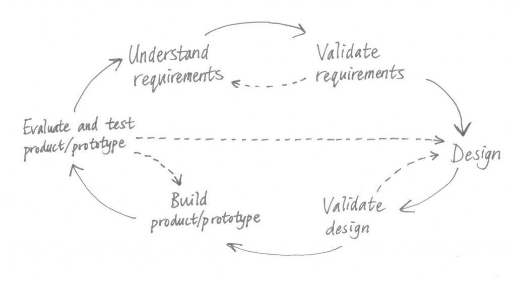
Attempts to illustrate an iteration of the design cycle usually end up looking something like this:
This diagram is unsatisfying, though: it suggests that the activities are separate and take place sequentially, and this is not always the case. There is often constant, fluid switching between the different activities, and team members will usually be working on different activities simultaneously in parallel.
In addition, the nature of different products can enable various different design approaches:
- For products with formal processes and very specific externally-imposed requirements, such as a tax calculator, requirements analysis and specification usually have to be figured out fairly thoroughly before detailed design can proceed.
- On the other end of the spectrum, products such as games have no real requirements — just about anything goes, design-wise — and so requirements analysis virtually disappears.
- Most products fit somewhere in the middle, and requirements analysis and design proceed together in a tightly meshed fashion. Sometimes requirements aren’t formally recorded at all, and instead the design is simply continually adjusted to match the new learnings about how the product should work. So in these cases, the Understand requirements and Design activities merge together.
And for products that lend themselves to rapid prototyping, often no formal design documentation is ever recorded. The prototype is the representation of the design, and so the Design and Build activities merge together.
The User-Centered Design approach recommends that you involve users in requirements gathering, and in the usability testing and evaluation of designs, prototypes, and the actual product.
In other blog posts, we’ll take a closer look at the activities in the design cycle. We’ll examine requirements analysis and validation, the process of design, prototyping, evaluating designs and prototypes, and conducting usability testing.


