Understanding the process of user interface design

Designing a user interface for a non-trivial product is a complex task.

One traditional approach to designing and building software products was the waterfall model, where requirements are first gathered and written up in specifications documents. These are then handed off to designers, who create designs and write design specifications. These are then handed off to developers, who build the product. The product is finally handed off to testers, who verify that the product matches the specifications.

This sounds fine in theory — it’s a very logical, rational decomposition — but for large, complex products, this approach never really seems to work very efficiently. For complex projects, it’s never possible for analysts and designers and programmers to get everything correct and complete on the first try, and so waterfall projects inevitably tend to break down into a chaotic scene of documents being passed back and forth between groups for correction. And since software projects span months or years, it’s very frequent that the requirements will change during the course of the project, meaning that by the time the product is finally built and released, it may no longer actually meet the needs of the users and stakeholders.

An effective way of bringing some order to this chaos is to recognize that complex analysis, design, and development work is never done completely or correctly on the first attempt; it takes many iterations of reviewing, revising, and testing to get it right.

An iterative approach to design and construction breaks the project into many short, structured cycles of work. In each pass around the cycle — each iteration — the work products get better and better and more complete. An advantage to this approach is that you get a basic functioning version of the product available for testing very early on in the project, and this early product can be used to discuss and further refine requirements with the project stakeholders.

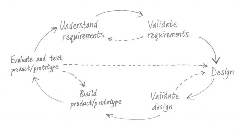
Attempts to illustrate an iteration of the design cycle usually end up looking something like this:

The Design Cycle (diagram)

The Design Cycle

This diagram is unsatisfying, though: it suggests that the activities are separate and take place sequentially, and this is not always the case. There is often constant, fluid switching between the different activities, and team members will usually be working on different activities simultaneously in parallel.

In addition, the nature of different products can enable various different design approaches:

  • For products with formal processes and very specific externally-imposed requirements, such as a tax calculator, requirements analysis and specification usually have to be figured out fairly thoroughly before detailed design can proceed.
  • On the other end of the spectrum, products such as games have no real requirements — just about anything goes, design-wise — and so requirements analysis virtually disappears.
  • Most products fit somewhere in the middle, and requirements analysis and design proceed together in a tightly meshed fashion. Sometimes requirements aren’t formally recorded at all, and instead the design is simply continually adjusted to match the new learnings about how the product should work. So in these cases, the Understand requirements and Design activities merge together.

And for products that lend themselves to rapid prototyping, often no formal design documentation is ever recorded. The prototype is the representation of the design, and so the Design and Build activities merge together.

The User-Centered Design approach recommends that you involve users in requirements gathering, and in the usability testing and evaluation of designs, prototypes, and the actual product.

In other blog posts, we’ll take a closer look at the activities in the design cycle. We’ll examine requirements analysis and validation, the process of design, prototyping, evaluating designs and prototypes, and conducting usability testing.

Posted in Product Management, Project Management, Requirements Engineering, Usability Testing, User-Centered Design | Leave a comment

Donald Norman’s design principles for usability

Donald Norman, in his book The Design of Everyday Things, introduced several basic user interface design principles and concepts that are now considered critical for understanding why some designs are more usable and learnable than others:

Consistency

One of the major ways that people learn is by discovering patterns. New situations become more manageable when existing pattern knowledge can be applied to understanding how things work. Consistency is the key to helping users recognize and apply patterns.

Things that look similar should do similar things. For example, if we learn that protruding surfaces with labels on them are buttons that can be pressed, then the next time we see a new protruding surface with a label on it, we’ll tend to recognize it as a pressable button.

Likewise, behavior and conventions should be consistent across similar tasks and actions. QuickBooks makes a chime sound whenever a record is successfully saved, and this is consistent, no matter whether you’re editing a invoice, a cheque, or a quote.

Inconsistency causes confusion, because things don’t work the way the user expects them to. Forcing users to memorize exceptions to the rules increases the cognitive burden and causes resentment. Attention to consistency is important for instilling confidence in the product, because it gives the impression that there is a logical, rational, trustworthy designer behind the scenes.

For desktop and mobile applications, you should aim to understand and conform to the user interface guidelines for your operating system or platform. Consistency with these standard conventions reduces the number of new things a user needs to learn.

Visibility

Users discover what functions can be performed by visually inspecting the interface and seeing what controls are available. For tasks that involve a series of steps, having clearly-marked controls in a visible location can help the user figure out what to do next.

The principle of visibility suggests that usability and learnability are improved when the user can easily see what commands and options are available. Controls should be made clearly visible, rather than hidden, and should be placed where users would expect them to be. Placing controls in unexpected, out-of-the-way locations is tantamount to hiding them.

Functionality which does not have a visual representation can be hard to discover and find. For example, keyboard shortcuts save time for expert users, but when a keyboard shortcut is the only way to activate a command, then a new user will have no way of discovering it, except by accident, or by reading the reference documentation.

The principle of visibility should not necessarily be interpreted to mean that every possible function should have a prominent button on the screen — for any complex application, there would be so many buttons that the screen would become crowded and cluttered, and it would be difficult to find the right button. Pull-down menus are an example of a compromise: the commands are visible when the menus are opened, but remain tucked out of sight most of the time. And in a full-featured application, you may want to consider only presenting the commands and controls that are relevant to the user’s present context. In Photoshop, for example, one of the toolbars shows the settings for the current drawing tool and omits any settings that are irrelevant for that tool.

Affordance

An affordance is a visual attribute of an object or a control that gives the user clues as to how the object or control can be used or operated.

The standard example used for explaining affordance is the door handle. A round doorknob invites you to turn the knob. A flat plate invites you to push on the plate to push the door outwards. A graspable handle invites you to pull on the handle to pull the door open towards you.

Applying the concept of affordance to graphical user interfaces, you can use visual cues to make controls look clickable or touchable. One common technique is to make buttons and other controls look “three-dimensional” and raised off the screen by using colors to simulate light and shadows. Dials and sliders can be made to look like real-world controls. Whenever possible, you should use the standard controls (“widgets”) provided by the operating system or platform; this makes the controls easily recognizable because the same controls are used by other applications.

Design conventions are another means of providing affordance cues. For example, underlined blue text is a standard convention for representing a textual link on a webpage. There is nothing inherently obvious about underlined blue text that makes it mean “I’m a clickable link”, but it is a widely-used standard that users have learned.

In desktop systems with pointing devices, another way of showing affordance is to change the shape of the mouse pointer when the mouse pointer is moved over a control. Tooltips, or small pop-up messages that appear when the mouse pointer hovers over a control, can provide some additional assistance.

One particularly challenging thing to show affordances for is indicating that some element can be dragged-and-dropped, or that some element has a context menu available by right-clicking on it.

Mapping

Pressing a button or activating a control generally triggers the system to perform some function. There is a relationship, or mapping, between a control and its effects. You should always aim to make these mappings as clear and explicit as possible. You can do this by using descriptive labels or icons on buttons and menu items, and by using controls consistently (again, similar controls should have similar behavior and effects).

Controls should also be positioned in logical ways that match real-world objects or general conventions. For instance, it’s obvious that a slider control to adjust the left-right balance of stereo speakers should increase the volume of the left speaker when the slider is moved to the left. Or if you have an ordered list or a sequence of steps, these should obviously be positioned in left-to-right or top-to-bottom order.

The flight stick in an aircraft or flight simulator might be considered by some to have a non-conventional mapping. Pulling the stick downwards and towards you causes the aircraft’s nose to point upward, while pushing the stick up and away from you causes the aircraft’s nose to point downward. This is because the position of the flight stick controls the flaps on the wings, and if the flaps are down, this will cause the aircraft to climb. The mapping becomes natural for a trained pilot, but can initially seem backwards to new pilots.

Feedback

If you press a button and nothing seems to happen, you’re left wondering whether the button press actually registered. Should you try again? Or is there a delay between the button press and the expected action?

The principle of feedback suggests that you should give users confirmation that an action has been performed successfully (or unsuccessfully). We might distinguish between two types of feedback:

  • Activational feedback is evidence that the control was activated successfully: a button was pressed, a menu option was selected, or a slider was moved to a new position. This evidence could be provided with visual feedback: an on-screen button can be animated to give the appearance of being depressed and released. Physical controls can provide tactile feedback; for instance, you can feel a button clicking as you press and release it. Auditory feedback could also be provided in the form of a sound effect.
  • Behavioral feedback is evidence that the activation or adjustment of the control has now had some effect in the system; some action has been performed with some result. For example, in an e-mail client, after clicking the “Send” button, you may get a confirmation message in a pop-up dialog, and the e-mail will be listed under the “Sent” folder.

One business system I’ve encountered offered a menu option for generating a report. When this menu option was selected, nothing appeared to happen. Because no feedback was provided, it was unclear whether the report generation was triggered correctly, and if it was, it was unclear whether the report was generated successfully. It turned out that a report file was created in a certain location in the file system, but the system did not tell the user where to find this file. This system could be improved by giving the user feedback: at the minimum, a confirmation should be provided indicating that the report was created successfully, and better yet, the report should be automatically opened for viewing as soon as it is available.

Constraints

Interfaces must be designed with restrictions so that the system can never enter into an invalid state. Constraints, or restrictions, prevent invalid data from being entered and prevent invalid actions from being performed.

Constraints can take many forms. Here are some examples:

  • A diagramming tool for drawing organizational charts will prevent the boxes and lines from being dragged-and-dropped and rearranged into configurations that are not semantically legal.
  • Word processors disable the “Copy” and “Cut” commands when no text is currently selected.
  • The dots-per-inch setting on a scanning application is often controlled by a slider that restricts the chosen value to be within a range such as 100 to 400 dpi. This is a good example of a control that can show a constraint visually.
Posted in Psychology for UX Design, Usability, User Experience Design, Visual Design | 3 Comments

How do users perform tasks, do work, and learn how to use software applications?

Users interact with software by performing physical actions with input devices such as keyboards, mice, touchscreens, and microphones. Graphical user interfaces present controls like buttons, sliders, and drop-down boxes, and the user performs actions on these controls, either directly by touching on a touchscreen, or indirectly via mouse clicks or keyboard keystrokes. Non-graphical interfaces generally rely on entering commands to perform actions.

But how do users know which actions to perform to get their work done?

The usual model for thinking about this involves a hierarchical breakdown of work into goals, tasks, and actions.

A user usually has a high-level goal in mind of what she wants to accomplish with the application. She may want to write a letter, or retouch a photograph, or have a video chat with a coworker, or pay her credit card bill, or compare prices for vacation packages. Goals are statements about what we want to achieve, rather than how it will be achieved.

To accomplish a goal, the user usually has to perform some number of steps or structured activities that we could call tasks.

To perform a task, the user will perform actions in the interface. Actions are operations such as pressing or clicking on a button, entering text, selecting something from a menu,  dragging-and-dropping an icon, and so on.

Let’s imagine that a user of a word processor has the goal of writing a letter. This goal might be achieved with some combination of the following general tasks:

  • Creating a new document
  • Entering text
  • Editing and proofreading text
  • Spell-checking
  • Adjusting page formatting
  • Previewing
  • Printing

To accomplish the task of creating a new document, the user might perform the following series of actions in the interface:

  • Click on the “File” pull-down menu
  • Click on the “New” menu option
  • Enter a document title in a dialog box
  • Click on the “OK” button to close the dialog box

Or alternatively, a shortcut keystroke Alt-N might be used, or perhaps the user might open an existing document and re-save it with a different filename.

It’s important to understand that goals can often be achieved by means of various different tasks, and tasks can often be achieved by means of various different actions. And while there may be some cases where tasks can be achieved by following a strict step-by-step sequence of actions, in many cases, such as entering and editing text in a word processor, tasks are more of an ongoing or iterative process, and tasks might become intermixed as work is done towards reaching the goal.

An experienced user will usually know what tasks are needed to accomplish a goal, and what actions are needed to accomplish each task. Experienced users have a well-developed mental model of how the application works, with this knowledge having been acquired by experience, by trial-and-error, and in some cases, by reading documentation or by having undergone training.

New users learning how to use an application, on the other hand, are usually uncertain about how to accomplish tasks, and may even be uncertain about what tasks are necessary to achieve a goal.

When first trying to accomplish a task, a user will explore and inspect the interface for clues. Once she identifies a potential action that will help move her along the path to accomplishing the task and achieving the goal, she will execute that action, and then observe what happens. If the results of the action matched what she expected, then she will continue on with the next step in completing her task. If not, then she may try an alternative action — or she may choose to modify the task or the goal. She will continue this cycle of searching for suitable actions, choosing actions, performing actions, and evaluating the results, until her goal has been satisfactorily achieved, or until she gets stuck and needs assistance to continue.

Donald Norman discussed this process more formally in his book The Design of Everyday Things, describing it as a seven-stage action cycle model consisting of the following steps:

  1. Identifying an immediate goal
  2. Forming an intention to act
  3. Determining a plan of specific actions
  4. Carrying out the actions
  5. Observing the results by perceiving the state of the system and the world
  6. Interpreting the results
  7. Evaluating whether the actions had the desired results

These steps are repeated in an ongoing cycle, and so this model describes human-computer interaction as an continuous feedback loop between the user and the application.

Posted in Psychology for UX Design, Usability, User Experience Design | Leave a comment

Understanding the technology framework for building your product’s user interface

If you are designing the user interface for an application, you will likely begin with rough conceptual sketches, but at a certain point, in order to create detailed designs and high-fidelity prototypes, you will need to know what software framework or technology will be used for building the user interface.

The user interface framework will provide user interface controls or “widgets” — buttons, text fields, drop-down boxes, and so on. Knowing what set of controls you have to work with and what they look like is obviously important for design and prototyping. For the purposes of visual design, it is also good to know the degree to which the look-and-feel of the controls can be adjusted and customized, and what mechanisms are used for managing the page layout.

The technology framework that will be used for implementing the user interface can impose constraints on your designs. In particular, different web application frameworks can vary widely in their capabilities. For instance, some frameworks offer the ability to present modal popup dialogs, while others do not; older frameworks may not support partial page refreshes, requiring entire pages to be reloaded to show new data. The Oracle ADF framework, as of the current writing, does not offer any means for disabling or hiding options in pull-down menus.

If the framework chosen for your product has limitations, you will need to be aware of them and find ways to work around them — but these workarounds can often impact usability. If the problems are serious enough, you may need to reconsider the choice of framework, and it’s better to discover and decide this early on in the project, rather than later, after most of the product has already been built. Thus getting a good understanding the framework and its capabilities and limitations is a critical early step in user interface design.

In some projects, UX designers may have some input into which user interface framework will be chosen for the project. But in most projects, technical architects choose the technology stack — the set of frameworks that will be used to develop the software, including the user interface layer — based on technical considerations, cost analyses, political factors, and sometimes, personal preference. The UX designer, who is typically brought in at a later stage in the project, is then left to design interfaces that are implementable with the chosen technology.

The choice of user interface framework should be decided upon careful consideration of the requirements, or at least the best known understanding of the requirements at the early stage of the project, and ideally a user experience designer should be involved in determining those requirements.

Posted in Office Politics, Requirements Engineering, Uncategorized, Usability, User Experience Design, Visual Design | Leave a comment

An introduction to data models and UML class diagrams for user interface designers

In the previous post, we argued that the ability to read and interpret data model diagrams is an important skill for user interface designers working on business information systems or other applications that involve a lot of structured data. In this post, we will take a very brief look at UML class diagrams, a popular way to visually depict a data model. (UML is the Unified Modelling Language, a standard for visual software modelling.)

In a UML class diagram, we can represent entities (classes), attributes, operations, and various types of relationships between entities. Let’s understand these by examining the following simplistic UML class diagram showing part of the data model for a banking application:
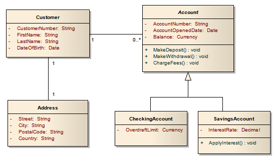
The boxes represent the various entities that the product needs to know about. (When we are talking about things in the domain, we usually use the term entities, but when these entities are implemented in software, they are more frequently called classes. We’ll use the term entities here for clarity.)

An entity is an definition of what information is needed to represent a thing or a concept, or a set of similar things or concepts. Entities basically represent nouns.

In our example diagram above, the Customer class represents all of the pieces of information, or attributes, that our application needs to know about customers: their customer numbers, their first and last names, and their dates of birth. For each entity, there will usually be many concrete instances of that entity (also known as instantiations, records, or objects) known by the system, and each instance will have its own separate set of values for each attribute.

In other words, for our Customer entity, if the system knows about 500 different customers, then there will be 500 instances of the Customer entity in the system, and each of those 500 Customer instances will have its own set of values for the attributes. One Customer instance might be for a customer with a customer number of 1234567, first name John, last name Smith, and date of birth 05.05.1965. Another Customer instance might be for customer number 2345678, Alice Jones, born 07.07.1977.

In UML class diagrams, the box for an entity is divided into multiple sections:

  • The top compartment contains the name of the entity, such as Customer.
  • The middle compartment lists the attributes for the entity. Attributes are the fields that describe the properties of the entity. So if the entity is a noun, the attributes might be thought of as adjectives that describe the noun. For the Customer entity, the attributes are CustomerNumber, FirstName, LastName, and DateOfBirth. In domain models, usually just the attribute names are given; for data models suitable for implementation in software, the data type for each attribute is usually given as well. Here, “String” means text, “Date” means a calendar date, and so on.
  • The bottom compartment of the box is optional and is frequently omitted. It lists any operations or actions that software implementations of instances of that entity can perform. These operations can be thought of as verbs that the entity, a noun, can do. Not all entities will have operations, and operations are typically listed only in data model and not in domain models. (The notation used for naming the operations usually reflects the programming language being used in the system, which is why the example diagram here includes the additional brackets and the “void” annotation.)

Relationships

Relationships between entity classes are represented with lines drawn between boxes. The UML standard uses various styles and combinations of lines and arrows to indicate different types of relationships. Let’s examine the two most common relationship types: associations and inheritance.

Association relationships

The most common type of relationship is the association, represented by a plain line linking two boxes. An association relationship means that two entity instances (objects) can be linked together. In our example diagram above, Customer instances can be linked with Address instances and Account instances.

The numbers alongside the relationship lines indicate what is called the cardinality of the relationship. In the sample diagram, the association between Customer and Address is what is called a 1-to-1 relationship, and this means that every Customer instance must be linked to exactly one Address instance. In other words, a Customer cannot have more than one address, nor can a Customer exist who doesn’t have an address on file; every Customer instance must always be linked to an Address instance. And likewise, an Address instance cannot exist in the system if it is not linked to a Customer, and an Address instance can only be linked with one specific Customer. This particular model diagram doesn’t allow two customers (a husband and wife, for instance) who happen to live at the same postal address to share one Address record in the system; each Customer must have its own Address, which means there would be data duplication (two Address records holding the same postal address data) — which may have usability consequences.

The association between Customer and Account, on the other hand, is an example of what is generally called a 1-to-many relationship. There is a cardinality indicator of 1 on the one side, and the other side, the 0..* notation is shorthand for “zero or many”.

This means that the number of Account instances that a Customer can be linked to can be between “zero” and “many”. So a customer in the system might have no accounts at all, or he or she might have one account, or he or she might have two or twenty or even more accounts.

But the 1 on the other end of the association means that an Account can only belong to one Customer; two Customers cannot share an Account (at least according to this data model).

Inheritance (specialization/generalization) relationships

Another type of relationship is the inheritance relationship, drawn with a plain line with an open triangular arrowhead at one end.

If you see an inheritance relationship where the arrowhead points from, say, entity Dachshund to entity Dog, this indicates that entity Dachshund inherits the properties of Dog. Dachshund has a copy of all of the properties of Dog, but may have additional properties of its own. We can say that that Dachshund is a subclass of Dog, or we may say that Dachshund is a specialization (or a specialized type) of Dog. And if Dog had multiple subclasses, like Dachshund, BlackLab, and Poodle, then we would say Dog represents the generalization of the commonalities amongst the subclasses.

In our banking example above, there is an entity called Account, and below it, there are two entities, CheckingAccount and SavingsAccount, which are specialized types (subclasses) of Account.

Instances of the CheckingAccount entity take on all of the attributes and operations of Account, and additionally have the attributes and operations specific to CheckingAccount. So a CheckingAccount instance has the attributes AccountNumber, AccountOpenedDate, Balance, and OverdraftLimit, and can perform the operations MakeDeposit, MakeWithdrawal, and ChargeFees. Likewise, a SavingsAccount instance has the attributes AccountNumber, AccountOpenedDate, Balance, and InterestRate, and can perform the operations MakeDeposit, MakeWithdrawal, ChargeFees, and ApplyInterest.

When a customer opens a checking account at the bank, a link is made between the Customer instance and a new CheckingAccount instance. And when a customer opens a savings account, a link is made between the Customer instance and a new SavingsAccount instance. Because a Customer can have between “zero” and “many” accounts, a Customer may be linked to multiple CheckingAccounts and SavingsAccounts, or none at all.

But a Customer will never actually be linked to an instance of Account. Why? Account is what we call an abstract supertype — no instances of that type can actually be created in the system. You can only create one of the subtypes. So if a customer wants to open a new account, he or she must choose between a CheckingAccount and a SavingsAccount, as no “general” Account can be created.

If you look closely, you will see in the diagram that the entity name “Account” is italicized. This italicization is the convention used in UML for marking an entity as being an abstract entity. Because this is so subtle visually, so you can additionally add the notation “<<abstract>>” inside the top compartment of the box if you want to bring more attention to the fact.

Interpreting data models for user interface design

So why are data models so important in many projects?

First of all, the data model tells you what attributes are present for each entity. So if you are designing a form or a screen for editing a customer’s address, the data model tells you what fields you have to work with.

Likewise, the relationships between the entities are important for user interface designers to know, because these associations reveal how all of the data is related, and your application’s interface cannot be designed in such a way that it violates the relationships in the model. So if the data model allows customers to have multiple accounts, then you need to design the product to allow the user a way to view and access all of the accounts. This means that the product will look and behave differently than it would if customers were only permitted to have a single account.

Changing a data model to better fit the real world

You might say that some of the rules we’ve just discussed above for customers and addresses and accounts are not very practical for a real bank — two spouses should be able to share a joint account, for instance. And that’s correct — this is a highly oversimplified data model.

If you’re working with a data model that has been designed by somebody else, it’s often inevitable that you come to some disagreement over how the entities and relationships have been designed. In our bank example, you might argue that customers should be able to have multiple addresses on file, such as a work address as well as a home address. Or you might want the system to keep track of all of the address changes in the past. Or you might want address records to be shared by multiple customers in the same household, so that a change-of-address need only be done once, and the new address becomes effective for all of the customers sharing the address record.

If the design of a data model is hindering your ability to design a usable interface, because the designer’s data model doesn’t quite match the way your users want or expect things to be, then you should propose changes to the data model and discuss them in with your project team. Developers and project managers can be resistant to changing the data model because some types of changes can involve a lot of work, expense, and uncertainty.

Keep in mind that changing the data model early on in a project is much easier than making changes once the software has been built and is being used by users — there can be some very tricky data conversion and migration issues to consider.

Usability concerns in moving from a data model to screen designs

There is often a temptation to map one-to-one from data models to screen designs in a mechanical fashion, and in fact some systems exist that can translate data models or database schemas into rudimentary user interfaces. The use of entities often lends itself to having separate screens or tabs or other sections that correspond to various entities, but beware that this is not always desirable from a usability perspective. Sometimes there may be fields that logically belong near each other on the screen, but the fields may be stored in attributes in different entities in the model. And mimicking the data model too closely can often force the user to have to create the right instances of the right entities in the right places in order to get tasks done, which is a very poor approach from a usability perspective; this would essentially force the user to know all the details of the data model without having access to a copy of the data model diagram!

Focus on the users’ needs first. Use the data model to inform yourself of what entities and attributes are available, but then design the screens in a way that makes logical sense. Think about the work and tasks that the users have to do, and design task flows that guide them through the work with a minimum of memorization. Focus on designing a user-friendly experience first, and then worry about defining the mappings between the on-screen elements and the data model.

Summary

While this brief introduction to UML class diagrams only scratches the surface, it will hopefully get you started if you’re a user interface designer who hasn’t encountered data models before and now needs to be able to read and interpret them in a project. If you want to learn more about UML, a web search will uncover plenty of useful resources.

Posted in Information Architecture, Requirements Engineering, Usability, User Experience Design | Leave a comment

Why understanding your application’s domain and data model is a prerequisite for good user interface design

All software manipulates information or data in some way, and to be able to design a user interface for a product, you need to understand the information that the product will present and manipulate, and how this information is structured.

Many types of projects don’t have particularly strict requirements, and in these projects, a top-down approach to design works well: The user interface designer sketches out designs for how the application should look and work, and from these designs, the technical architects and developers proceed to figure out the data structures needed to support it. Games would be the best example of products that can be designed with this approach.

On the other hand, imagine you’ve been hired to design the user interface for an income tax preparation software package. You can’t just make up whatever you want out of thin air like a game designer could — there are strict requirements on what data you must let the user enter! And so as a user interface designer working in such a project, you would have flexibility in terms of how you would design the look-and-feel of the application, and you would decide how to break up all the information the user must enter into different screens or forms. You would then design the layout and behavior of each of those screens or forms. But you would be constrained to include specific fields like “Taxable Income from Employment” on those forms, and if you didn’t, your application would not be able to calculate the correct tax amounts and would essentially violate the law. Your product would not be certified for sale by the taxation authority.

So for highly structured, data-driven systems with strict requirements, design tends to follow more of a bottom-up approach. The structure of the relevant data needs to be determined before the user interface can be designed, because the user interface is centered around presenting that data, and you need to know what that data is before you can design a screen to show it. (However, don’t interpret this to mean that a perfect and complete understanding of the structure of the data must be finished before user interface design can begin; in reality, both tend to change and co-evolve together over the course of a typical project.)

In most business system projects, a domain model or data model is created to describe what pieces of data need to be known and managed by the system, and how those pieces of data are interrelated.

  • A domain model is a high-level, technology-neutral description of relevant general concepts and entities in the application’s domain; for example, banking software deals with the domain of banking, and so accounts, interest, deposits, withdrawals, loans, credit cards, and fees are examples of things in that domain.
  • A data model is a more specific description of all of the relevant entities, attributes, and relationships that the software must manage, usually at enough detail to enable the model to be translated into software.

In a typical project team, the domain model and/or data model are usually created by one or more business analysts or requirements engineers, often with the help of Subject Matter Experts (SMEs) who are experts in the particular application domain. In other smaller teams, though, roles may be more fluid, and one person — perhaps someone with the title “product manager” — may be responsible for both discovering and documenting the data model and designing the user interface.

This is not a book on data modelling or requirements engineering, but to be an effective user experience designer in most types of projects, you need to be able to at least read and understand a data model, if not create one yourself. Therefore, it’s worthwhile taking a look at an example of a data model.

There are various ways to present data models, and visual notation systems are popular (though one need not necessarily use visual diagrams to document a data model).

A long-standing visual diagramming system is the Entity-Relationship Diagram (ERD), which has traditionally been popular for applications that store their data in a relational database.

While ERDs are still very common, the Unified Modelling Language (UML) is now considered the de-facto standard visual modelling language for software developers. UML consists of 14 types of diagrams. One of these, the UML Class Diagram, is similar to the Entity-Relationship Diagram, but has additional features that make it more expressive for representing real-world situations. In the next post, we’ll take a look at an example of a basic UML Class Diagram, and we’ll see how such a data model can aid you in designing an effective user interface for your product.

Posted in Information Architecture, Requirements Engineering, User Experience Design | Leave a comment