How do people look at and read pages? (Part 2 of 3)

In Part 1 of this series, we took a brief look at how human vision works, and we began examining how readers read blocks of text and visually scan pages and screens.

To better understand how people look at visual information, researchers have conducted eye-tracking studies using specialized cameras and software that can track what a user is looking at on a screen. The software can then play back the scanpath – the series of fixations and saccades – to show what areas of the screen the participant has looked at and how long they have spent gazing at each fixation point. While the scanpaths of individual users can vary quite a bit, if you ask a number of users to look at the same webpage or screen, you can create “heatmaps” that show where users spend the most time looking.

Probably the most detailed, or at least best-documented, eye-tracking studies have been done by Jakob Nielsen and Kara Pernice in their book Eyetracking Web Usability. They discovered some interesting findings:

  • For most websites, rather than following the Z-shaped scanning pattern, most users follow a roughly F-shaped pattern. They read across the top, and then go down the page and read lines of text left to right. But users are, in general, more likely to read complete paragraphs or lines of text near the top of the screen, whereas they tend to lose interest and just briefly scan the text near the bottom of the page. And then, upon reaching the bottom of the screen, users often apparently make an additional quick scan down the left-hand edge of the page (especially if there is a sidebar with links). So if you make a heatmap of the parts of the screen that get noticed and read, it makes a roughly triangular shape, indicating that most attention is given to the upper-left corner and little attention is given to the lower-right corner (see some of these heatmap images at Jakob Nielsen’s site).
  • Graphics and especially photographic images can attract attention, but only when they are a relevant and integral part of the content. People seems to be able to quickly judge whether images are just decorative stock photos, and such superficial photos get very little attention.
  • Users tend to ignore elements that are repeated on multiple pages – once they’ve seen the logo or navigation bar at the top of the page, they don’t look there again unless they need to. Most significantly, a majority of users pretty much completely ignore banner ads; when there was a banner ad at the top of the webpage, most users started their F-shaped scans below the ads, where the content begins.
  • One amusing finding was that, when looking at images of people, the female users in the study tended to look only at the person’s face, whereas the male users looked at the face but also glanced down to check out “private anatomy” (cleavage and crotches).

Something that I haven’t seen discussed in eye-tracking studies is the degree of focus of the viewer’s eyes. I personally sometimes scan pages by defocussing my eyes, which makes the page look a little blurry, but enables you to perceive the whole layout at once, somewhat like viewing the page from ten feet away. I don’t believe that eye-tracking equipment can detect the degree of focus, only the direction of gaze.

In the next post, we’ll look at some ways to influence the paths that readers’ eyes follow when they see a page or screen.

[ad#AdSense_Banner]

Posted in Visual Design | Leave a comment

How do people look at and read pages? (Part 1 of 3)

We’re going to start our exploration of visual design techniques by talking about composition, or how you lay out and balance the components of a page or screen. But before we get into composition techniques and principles, let’s first learn about how people visually scan pages and screens.

Visual designers have long been interested in figuring out how to guide readers’ eyes across the printed page or computer screen. Artists creating posters use emphasis and positioning to draw your attention to a headline; cartoonists carefully draw cartoons so that you notice the characters and read the speech bubbles in a certain order; otherwise, the jokes might not make any sense.

By laying out elements on the page in certain ways, you can affect the order in which people will notice the elements and how long they will spend looking at them. Or, perhaps more relevant for software designers: If you know that people will tend to scan a page in a certain way, you can design your page to accommodate those usage patterns, by putting relevant information in the places where people are likely to look.

So, let’s begin by examining how readers read text on a page.

If a reader is reading a book, like a novel, where every page consists of rows of text (we’ll assume there are no illustrations), then the reader will start by looking at the first word in the top-left corner of the page, scan across the line from left to right to read the words, and then skip to the beginning of the next line. The reader will again scan left to right to read the line, skip to the next line, and continue in this pattern until the bottom of the page is reached. (And, yes, in languages like Arabic and Hebrew, readers will read right-to-left instead.)

However, when the eye scans across a line of the text, it’s not actually a smooth movement as you might expect. Rather than moving smoothly in a line, the eyes instead jump rapidly between spots on the page, called fixation points. These jumps are called saccades. The brain doesn’t receive any visual information during saccades, but it’s able to stitch together the images received at the fixation points, and the brain perceives it as “seeing in a line”.

The area that you can see clearly at each fixation point – i.e., the area that you can focus on – is called your foveal vision, and that area is surprisingly small: it’s only about two degrees of your visual field, or about twice the width of your thumb if you stick your thumb out at arm’s length. Try holding your arm out straight and put your thumb on a paragraph of text on your screen right now. Look at your thumb, and without looking away, try to see how many words on the screen you can clearly distinguish around your thumb. Your area of focus is pretty limited, isn’t it?  You’re still able to perceive the rest of the screen in your peripheral vision, but you can’t see those other parts of the screen clearly; you can only resolve text in the narrow area that you’re focusing on.

Now that we know a bit more about how human vision works, let’s go back to how readers perceive pages and screens. For page layouts that are more complex and heterogeneous than solid blocks of text, it’s more difficult to say exactly how readers’ eyes will move across the page, and of course, it will differ for each reader, but we can try to make some generalizations.

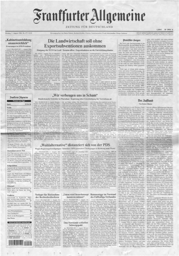
Traditionally, visual designers have said that when readers look at a complex document like a newspaper, they generally first get an overall impression by scanning the page in a Z-shaped pattern. They start in the upper-left corner, read the title of the newspaper across the top, and then, beginning at the upper-right corner, they gradually skim over the page in a roughly diagonal line until they reach the lower-left corner. Then they skim across to the right, ending in the lower-right corner. Then readers will go back and focus on whatever interests them.

Naturally, this is a vast generalization (and I’m not sure if there are any studies to support this, or whether this is just conventional “received wisdom”). It’s probably true for newspapers without much in the way of color photos or attention-getting headlines… like the staid German daily Frankfurter Allgemeine Zeitung:

Photo of front page of Frankfurter Allgemeine Zeitung (a newspaper)But if there is something flashy or exciting on the page – a large color photo, or a bold, interesting headline – the reader will probably look at that first, or perhaps the reader may indeed begin a Z-shaped scan, but interrupt it to look at the interesting bits. Do your eyes follow a Z-shaped scan when you see this Bild tabloid?

Photo of front page of a Bild tabloidAgain, general page-scanning patterns are generalizations, and there will be countless exceptions. For example, someone looking for some specific detail will probably search through the page in a different pattern than someone who is just browsing.

We’ll continue this discussion in the next post, where we’ll look at what eye-tracking studies can tell us about how people look at a page or screen.

[ad#AdSense_Banner]
Posted in Visual Design | Leave a comment

The impact of visual design on usability

It might be obvious and redundant to say this, but the usability of a software product or a website depends on its user interface. There’s probably a bunch of code and usually a database underneath, but the user doesn’t really see any of that – the user only sees and works with the user interface.

So what is a user interface?  Once way to look at it is “presentation + behavior”.

The presentation is the content or the data, and the controls the user can click on or otherwise activate, tied together with a visual design.

The behavior is how the user interface reacts and what the application or website does when you operate the controls.

Underlying both is a conceptual model that includes a model of the business domain – what concepts or entities are involved, what they’re named, and how they’re interrelated.

Behavior is important, but for now, let’s first concentrate on the presentation side. Putting some effort into getting the presentation right is important for a lot of reasons.

The visual design – the layout, colors, fonts, and so on – differentiates your application or website from others, and is one of the first things your users will notice when they encounter your product. What will their first impression be?  If your product looks professional, it will inspire more trust and confidence than a product that looks sloppy. Is your application or website an inviting and friendly place to be?

Beyond first impressions, the presentation gives the user the means to discover and activate the functionality that your application or website provides. Functions might be activated by picking menu entries, clicking on icons in a toolbar, typing commands, directly manipulating visual objects (e.g., painting on a canvas in a paint program, or moving a spaceship in a game), or other means.

Making the possible actions and functions visible is important when users are learning how to use your application. For example, users looking for a search function will be able to find it if there is an appropriate icon in a toolbar, or a text box labelled “Search”, whereas if a search has to be activated by pressing Ctrl-F7, users will probably never discover it. But there are trade-offs to consider. Putting hundreds of confusing icons in several rows of toolbars might be overwhelming. Placing them in cascading pull-down menus might clean up the clutter, and would give the user textual descriptions instead of icons to decipher – but it will take longer to navigate through menus to activate a function. And power users might want that keyboard shortcut so that they don’t have to reach for the mouse. We’ll talk about these kinds of trade-offs in later posts.

Additionally, the layout of screens or pages can explicitly or implicitly communicate relationships between entities. For example, grouping things together in one area of the page suggests that they are related. And if there’s a header over a block of text or a set of fields, you’d expect the all the things under that header to relate to what the header says. Careful attention to layout can make understanding your application easier, while sloppy and inconsistent layouts can confuse users.

In the next few posts, we’ll start exploring the basics of visual design and page layout.

[ad#AdSense_Banner]

Posted in User Experience Design, Visual Design | Leave a comment

Preview of upcoming topics for this blog

This blog is a place for me to think about and reflect on usability and UX design topics. A lot of the posts are condensed excerpts from the early draft manuscript of my upcoming book, Designing Usable Business Applications, which I’m hard at work on and which will keep me occupied for the next few months.

The previous few posts have defined and introduced some of the basic concepts and areas that this blog will cover – usability, User-Centered Design, User Experience design, and Information Architecture.

Some of the broad topics I will be addressing over the next few months include:

  • User requirements analysis techniques
  • Information architecture and the conceptual design of an application
  • Domain modelling
  • Psychological factors of human-computer interaction
  • Usability principles
  • Visual design and interaction design
  • GUI controls and how to use them
  • Prototyping
  • Usability testing techniques
  • User-Centered Design processes
  • Communicating requirements, designs, and specifications

I’ll cover each of these topics in depth with a series of posts. However, I will not necessarily cover each topic exclusively and exhaustively, and then move on to the next one. I’m writing and editing the different parts of the book in a non-linear order, and so the order of the posts will be a bit random, but I hope that will make things more interesting too.

However, I will try to ensure that initial posts for a broad topic area introduce the topic and define the basic terminology. Then, in later posts, I’ll try to link back to those introductory posts. Of course, if you want to find all of the posts on a certain topic, then please click on the appropriate link under the “Categories” heading in the sidebar.

And don’t worry – in the final book, everything will be smoothly sequenced in chapters arranged in a logical order!

Thanks for reading, and I welcome any feedback, suggestions, and criticism!

[ad#AdSense_MedRect]

Posted in About | Leave a comment

What is Information Architecture and why is it important in software application design?

Can your users find the information and functions they’re looking for?  Can your users understand the concepts and terminology used in your application?

Information Architecture is concerned with organizing information – concepts, entities, relationships, functionality, events, content – into a coherent structure or “information space” that is comprehensible, navigable, and searchable.

Information Architecture is a broad term, and not everyone agrees on what exactly the field covers. At the minimum, it involves naming and classifying concepts and entities, planning a navigation system, and designing search functionality. For most software projects, I would argue that Information Architecture should also include many parts of an application’s general conceptual design, including the framework for how users perceive tasks, workflow, and the saving of content or data.

Let’s explore some of the aspects of Information Architecture that you’ll need to think about when planning and designing a new application or website.

For “static” websites and applications that are mostly geared towards letting users browse and search content as opposed to creating or working with content – most intranets, library sites, static content websites, and e-book readers fall into this category – you generally need to consider the following:

  • Domain modelling

What are the concepts, entities, and events from the business domain that are represented in your application, how are they related, and what constraints are involved?

  • Naming and labelling

Are the concepts and entities named clearly, correctly, and consistently?  Names are what the human mind uses as a simple “handle” for complex or abstract concepts, names help us distinguish one concept from another, and names allow people to reason about and discuss concepts, so a proper naming system is critical for making a complex system learnable and usable.

  • Taxonomy

Can some or all of the concepts or entities be organized into categories and hierarchical inheritance relationships?

  • Navigation and wayfinding

How does the user move around the application and access content or data?  Is there a content hierarchy such as a table of contents or a sitemap, and how frequently is it likely to change?  How does the user perform navigation – by means of menus, trees, maps, hyperlinks, or other controls, or is navigation primarily done via searching?  How does the user know where in the application or content hierarchy they currently are?  Are there some navigation targets (e.g., pages, screens, or dialogs) that are only accessible in certain contexts, such as part of a task sequence?

  • Search and indexing

How is search functionality presented to the user?  What search options are available?  How are results presented?  How is content indexed and how is data queried for fast retrievability and optimum search results quality?

  • General visual presentation

How are typography, iconography, color, layout, and other design elements used to establish a consistent visual language and visual hierarchy that will (1) communicate the relative importance of the elements, and (2) reveal the relationships between entities?

For “dynamic” applications that allow users to create or edit content or perform processing that changes the state of the application’s data, then in addition to the aspects covered above, you also need to consider the following aspects, which I would argue are also part of the application’s Information Architecture:

  • Tasks and workflow

How is the application’s functionality presented?  How are tasks selected and how are they completed?  For tasks that involve processing by multiple users, how are the tasks and their intermediate states managed and presented?

  • Transaction and persistence concept (user-level, not technical)

How and when is the user’s work saved?  Does the user have to click a “Save” button or are all changes saved automatically?  Are database concepts like “commit” and “rollback” exposed to the user, or hidden?  In a concurrent environment, what happens when two users try to access the same data simultaneously?  Are records or files locked to prevent one user overwriting the other user’s changes, or is another strategy used?  When do changes become effective or visible to other users?  Is a history of versions kept?

Does all of this sound complicated?  Don’t worry – over the next few months, this blog will gradually but systematically address everything you need to know to successfully design the information architecture for your application.

[ad#AdSense_Banner]

Posted in Information Architecture, Product Management, Usability, User Experience Design | Leave a comment

Overcoming objections to involving users in your software project

According to the User-Centered Design (UCD) philosophy, actual users should be involved throughout all stages of a software or product development project. Firstly, users are indispensable while the project team learns about the users and their work (requirements gathering), and secondly, users can help test and validate the designs and prototypes, to ensure that the product is effective and usable.

UCD makes a lot of sense, and yet in many corporate environments, there is extraordinary management resistance to involving users in the product development process. Let’s examine some common objections to UCD and how you might address them.

  • “You can’t do that! That’s not the way things are done here. That’s not our standard practice.”

Gently identify flaws in the company’s current products that could have potentially been avoided if a user-centered design approach had been used. If it’s too politically sensitive to criticize the company’s products, then try finding examples in your competitors’ products, or in mass-market products you’re familiar with.

If you’re forced to use a company-wide standard project methodology, ask whether the status-quo approach has always delivered flawless results, or whether there’s potential room for improvement. Lean, competitive organizations are often willing to entertain and embrace ideas for doing things more effectively and efficiently.

  • “We don’t need to talk to users. The team has experts with all the knowledge to design the product.”

You’d be surprised at what you can learn from observing users doing their work, asking what problems they have with their current system or approach, and getting their ideas on what could be done better. It’s virtually guaranteed to challenge some of your long-held assumptions.

For enterprise applications, it often sounds like a good idea to only talk to the managers who oversee the users. But it’s important to talk to actual users who work with the system, and not just their managers: The reality of the way knowledge workers really get their jobs done frequently involves workarounds and special cases that their managers may overlook (or may not even be aware of).

  • “We have a very tight schedule. We can’t afford to spend all that time talking to users and involving them in testing.”

Getting the requirements right is important so that you build the right product. This will prevent the team from wasting valuable time on unnecessary features and rework. Likewise, testing the product as it is developed to ensure that it really meets the users’ needs will avoid costly disputes with the customer (for bespoke enterprise systems) or failure in the marketplace (for mass-market products) after the product is delivered.

  • “We don’t have staff experienced in these user-centered techniques.”

Your developers and business analysts can learn the techniques from books or training courses, or you might consider hiring a usability consultant.

  • “Marketing is responsible for talking to the customers.”

Some organizations suffer from ugly and unproductive conflicts between competing managers and departments over their areas of responsibility. Try to build consensus around the need to establish the best process for ensuring a quality product, as all departments will benefit if the product is successful.

  • “We don’t want to lose face in front of our customers if our staff asks questions that we should already know the answers to.”

Users and customers are usually more impressed that the team is taking the time and cares enough to understand their needs and provide a great product. If this is still a concern, then assign experienced senior staff to be involved with the users.

  • “If we involve our users and stakeholders, they will all have different ideas and opinions that will divert our project’s focus off track.”

Ensure that all proposed user requirements undergo a proper review process to ensure that everyone’s wished-for features don’t gradually sneak into the product scope (this is known as scope creep or requirements leakage) without analysis and confirmation by an authority. A process such as the Quality Gateway described by Suzanne and James Robertson in Mastering the Requirements Process is recommended for controlling the quality of proposed requirements.

  • “We can’t afford to let our competitors find out about our product development.”

Confidentiality is an important concern during the development of products to be sold on the open marketplace (it’s usually less of a concern for in-house enterprise applications). Consider non-disclosure agreements. Or, if possible, instead of working with users at your customers’ sites or recruiting users “off the street” (depending on your type of product), try to find users within your own organization.

  • “I don’t want someone on our team to make promises to users that we can’t keep.”

Ensure that users understand that their suggestions and feedback are important, and that the project will try to accommodate as many reasonable ideas as possible, but that no guarantees can be made for any particular feature requests. Explain that the project has deadline and budget constraints and must satisfy multiple stakeholders, and that compromises must be reached.

  • “We can’t afford to test with users. They might find a fatal flaw that will impact our deadlines!”

(Seriously?)  Much better to find serious flaws early, when they can be corrected, than to discover them after delivering the product!

[ad#AdSense_Banner]

Posted in Office Politics, Product Management, Project Management, User-Centered Design | Leave a comment